
Your Introduction to Watercolor Painting: Create With Confidence
Ciarra Rouwhorst · Fine Art Calligrapher & Designer
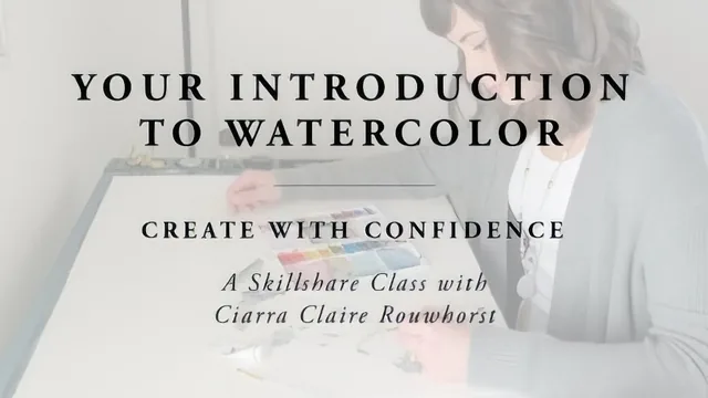
A designer's confidence-building crash course in materials and color mixing, not a step-by-step painting tutorial for beginners craving technique.
Ciarra Rouwhorst's watercolor class opens with a personal framing device: she used to get frustrated with watercolor, put it away for months, and only came back to it once she understood her materials better. That framing shapes the entire course. This is not a class about painting technique so much as a class about supplies, and about removing the guesswork that makes materials feel unpredictable.
Structure and What It Actually Covers
The first half is a materials audit. Paint gets a full comparison across a student-grade Prang set, a Japanese Gansai Tambi set, a Winsor and Newton Cotman travel palette, and Van Gogh tube paints, with attention to opacity, vibrancy, and whether a set is lightfast enough for finished work. Paper gets similar treatment, contrasting plain sketch paper against Canson, Strathmore, Moulin du Roy, and Arches sheets to show how sizing and texture change how pigment blends and pools. Brushes are covered but explicitly ranked last in importance, with natural bristle sets shown holding water better than stiff craft-store brushes.
The back half moves into practice: swatching a full palette to learn how each pigment behaves, building a labeled color mixing chart that cross-references every paint against every other, and then a dedicated lesson on mixing theory, primary to secondary to tertiary colors, and how warm versus cool undertones shift a mix toward vibrant or muddy. The class project itself is a single loose, water-driven watercolor background, built from a custom-mixed three-color palette and finished by tilting the board to let water and pigment pool and drain.
Strengths and Limitations
The paper and paint comparisons are genuinely useful and hard to find elsewhere in this much specific detail, since most beginner classes gloss over materials in favor of getting a brush moving. Seeing the same swatch technique fail on sketch paper and succeed on Arches cold press makes the abstract advice ("buy real watercolor paper") concrete and visual.
The color mixing chart is the strongest single exercise in the course. Building a full grid of every pigment mixed against every other, then keeping it as a permanent reference, is the kind of unglamorous groundwork that pays off far past the length of the class itself.
Where the course falls short is in actual painting instruction. There is no brush control practice, no wet-on-wet versus wet-on-dry comparison as a deliberate technique, no layering or glazing, and no representational subject matter at all. The final project is a single abstract wash, beautiful as a background but not a demonstration of painting skill in the way a beginner expecting to paint a flower or landscape might want. Anyone coming in hoping to learn how to actually render something will find the class stops well short of that.
Given its 89-minute length and narrow but well-executed focus, this earns its place as a materials-and-mixing primer rather than a true beginner painting course. It rewards viewers willing to do the swatching and charting homework, and it will frustrate anyone expecting brush technique or finished illustrations.
The standout
The color mixing chart exercise, where every paint in a palette is cross-mixed with every other into a labeled grid, gives a lasting personal reference no generic color wheel can replace.
What you will learn
- How to distinguish tube versus pan watercolors and judge paint quality by opacity, vibrancy, and lightfastness
- How to identify good watercolor paper by weight, texture (rough, cold press, hot press) and sizing, and why regular paper fails
- How to select and evaluate brushes for wash work versus fine detail
- How to build a personal swatch reference and a full color mixing chart to learn a specific palette
- How to mix primary colors into secondary and tertiary hues and neutralize colors to avoid mud
- How to plan and paint a loose, water-driven watercolor background using a custom mixed palette
Best for: Designers, hand-letterers, and craft-minded beginners who want watercolor textures and backgrounds for other projects rather than representational painting skill.
Skip it if: Anyone wanting to paint recognizable subjects, learn brush control techniques, or follow a guided step-by-step painting demonstration.