
Words With Meaning With Olivia Wilde
Jessica Hische · Letterer and Illustrator
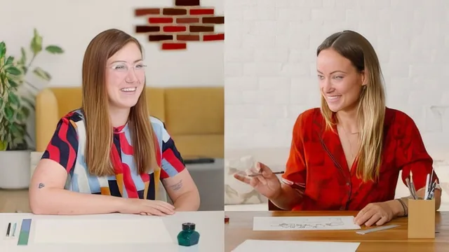
Fifteen minutes of Olivia Wilde sketching one poster with Jessica Hische, more heartfelt than instructive.
This is less a lettering class than a filmed conversation between two people making a single poster together, with lettering instruction happening almost incidentally in the background.
The course runs two lessons: a short trailer and one main session lasting well under fifteen minutes. Jessica Hische, an established letterer and illustrator, walks Olivia Wilde through creating a hand-lettered sign built around the phrase "Change takes courage," intended as a birthday gift for Wilde's daughter. The arc is straightforward: pick a letter style based on how bold or intricate the piece should read, decide which words in the phrase deserve visual emphasis, sketch rough layout options, choose one, then render it in pencil with attention to stroke weight.
The one piece of technique that actually lands is the explanation of thick and thin strokes. Hische shows that downstrokes should carry more weight than upstrokes, using a heavier pencil to make the effect visible on letters like A and H, and points out how crossbar height alone can shift a letterform's feel from Art Nouveau to mid-century. It is a genuinely useful nugget for anyone starting out with lettering, and it is explained clearly enough to try on paper immediately.
Everything else stays surface-level. The discussion of hierarchy, meaning deciding which word in a short phrase gets emphasized, is a reasonable design principle but is covered in under a minute and never developed beyond "make courage bigger." The layout exploration amounts to trying an arched word versus a straight line versus a curved arrangement, sketched loosely and settled quickly without much explanation of why one composition works better than another. There is no coverage of tools, materials, paper choice, ink, or how to move from pencil sketch to a finished, inked piece, which matters given the course description promises a poster and the lesson ends at a rough pencil draft.
What the course actually is
Structurally, this belongs to Skillshare's "Learning Experiment" format, where a celebrity is guided through a new skill on camera. The value proposition is watching a beginner struggle and improve in real time, not receiving a structured curriculum. Wilde visibly experiences the same anxieties any first-time letterer would, worrying about a blank page, over-erasing, tightening her hand too early, and the emotional beats around that (motherhood, wanting her daughter to look up to activists, the meditative quality of hand-drawing a phrase) take up as much runtime as the technical content.
Where it succeeds and where it doesn't
The rapport between the two hosts is warm and the closing reflection, that loving the process matters more than finishing quickly, is a nice sentiment for anyone prone to rushing creative work. But as instruction, the course is too short and too improvisational to leave a beginner with a repeatable method. There are no exercises, no supplementary materials implied beyond a blank sheet of paper, and no discussion of common mistakes beyond what happens to unfold spontaneously in the session. A viewer hoping to learn hand-lettering from scratch will finish this with a pleasant impression of the craft and one solid technical tip about stroke weight, but not with the tools to plan, sketch, and finish a piece on their own. It functions best as a mood piece about creative confidence, not as a lettering course.
The standout
The demonstration of thick-on-downstroke, thin-on-upstroke pencil pressure to fake calligraphic weight on plain block letters.
What you will learn
- How to choose a bold, legible letter style versus an intricate, decorative one based on viewing distance
- How to build a visual hierarchy by giving one or two words in a phrase more weight than the rest
- How to lightly sketch guide lines, arcs, and letter placement before committing to final strokes
- How thick and thin strokes follow downstrokes and upstrokes, using a heavier pencil to show the effect on letters like A and H
- How crossbar height on letters like H changes the era or personality a word conveys (Art Nouveau versus mid-century)
Best for: A total beginner curious about hand lettering who wants a quick, warm taste of the craft rather than a real skill foundation.
Skip it if: Anyone wanting an actual step-by-step lettering tutorial, structured practice, or techniques they can immediately replicate on their own project.