
Watercolor Illustration: Developing a Wedding Brand Suite
Carolyn Wiedeman · Artist, Illustrator
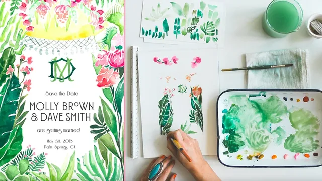
A slow, meditative watercolor course that teaches you to build seven wedding items from four painted assets, if you can stomach 89 minutes of unstructured demonstration.
What the course actually covers
Carolyn Wiedeman's class follows a single, well-chosen conceit: build an entire wedding paper suite from just four watercolor paintings. A hero botanical image, a monogram, a crest, and a geometric pattern border get painted once, then recombined in Photoshop into seven finished pieces (save-the-date, invitation, RSVP card, stationery, program, menu, and place card). The structure moves logically from mood-boarding to paint mixing, through each of the four assets, into digitizing, layout, typography, and print prep. For anyone curious about how a working illustrator turns loose paintings into a professional deliverable, that arc alone is worth following.
The most concrete, teachable segment is the Photoshop digitizing lesson. Wiedeman photographs her paintings by hand rather than scanning them, then uses the Levels dropper to click on the whitest part of the paper and even out the background before rasterizing and erasing stray texture. It is a genuinely useful, specific technique that generalizes well beyond watercolor work, and it is the closest the class comes to a step-by-step tutorial rather than a demonstration.
The typography lesson is similarly concrete: three fonts, each assigned a strict role. A decorative script for the most important information (names), a "workhorse" serif for dense text blocks, and a third accent font for secondary headers. Watching that hierarchy get applied consistently across seven different pieces is a clear, reusable lesson in restraint.
Where it falls short
The painting instruction itself is loose almost to a fault. Wiedeman talks through her choices, mixing ratios, and color intuition while painting, but rarely stops to isolate a technique the way a skills-focused class would. Brushwork, wet-on-wet blending, and color layering happen in real time with commentary, but a student without existing watercolor fluency will struggle to extract a repeatable method from it. The paints-and-tools lesson is helpful for shopping, but not for painting.
The class also leans heavily on taste and instinct rather than principle. Decisions about which asset goes on which item, or which font pairs with which line of text, are explained as "I think this looks nice" more often than as a rule a student could apply to a different project. There is a genuine framework buried in there (consistency with variation, each secondary asset repeating two or three times, the hero image standing alone) but it surfaces gradually rather than being taught upfront.
Print guidance is thin but useful: a quarter-inch bleed standard, the importance of ordering a physical proof, and the fact that hand-painted work does not require Pantone matching since color gets judged by eye anyway. These are practical, low-friction facts worth having, even if they only occupy a few minutes.
Overall, this is less a watercolor-technique class and more a case study in identity-suite thinking, wrapped in the visual language of a single painted wedding project. It rewards someone who can already paint and just wants to see how those paintings become a shippable, print-ready brand.
The standout
The Photoshop digitizing lesson, where the Levels dropper tool is used to flatten a phone photo's background to true white while preserving the paint's texture, is the single most transferable skill in the class.
What you will learn
- How to build a full paper suite (save-the-date, invitation, RSVP, menu, program, place card, stationery) from just four hand-painted assets
- Gouache versus watercolor handling, including how to mix from primaries and control opacity with white
- Photographing and cleaning up watercolor paintings in Photoshop using the Levels dropper and rasterizing for digital use
- How to design a monogram and crest lockup with alternating over-under letterforms
- A repeatable rule for font hierarchy: one decorative font for names, one workhorse font for dense text, one accent font for headers
- Print prep basics: bleed measurements, proofing, and why hand-painted color does not need Pantone matching
Best for: Illustrators and designers who already paint in watercolor or gouache and want to see how one artist repurposes a handful of paintings into a full branded print suite.
Skip it if: Total beginners to watercolor or Photoshop, since the course assumes paint handling skill and prior Photoshop familiarity and never slows down to teach either from scratch.