
Typography That Works: Typographic Composition and Fonts
Ellen Lupton · Author and educator, MICA
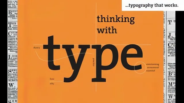
Ellen Lupton turns three type classifications into three business cards in 35 tight minutes of genuinely expert craft advice.
Ellen Lupton, a working author and MICA educator, packs a surprising amount of substance into a 35-minute course, and the substance holds up because she is teaching from genuine expertise rather than a generic script.
Structure and pacing
The course is organized around three type classifications, sans serif, serif, and slab, each treated as its own mini-unit with a historical tour, a set of finer technical points, and a business card project that applies what was just covered. This repetition is the course's smartest structural choice: rather than lecturing about alignment and kerning in the abstract, Lupton rebuilds the same business card three times, each time layering in new constraints, so the viewer sees principles turn into decisions in real time. The Sans + Structure unit walks through a full design process on a card for a fictional character named Miss Helvetica, starting from flush left text with an ugly ragged edge and ending with a resolved grid built from even margins on all sides. Watching her diagnose that first draft's rag as looking like "a staircase" or "the new moon," then fix it by rewriting the copy itself, is a concrete lesson that a lot of design tutorials never actually teach.
The historical framing throughout is unusually well chosen for a beginner course. Futura, Gill Sans, Univers, and Helvetica are introduced not as arbitrary options but as a lineage of "light and dark" palettes designers use to build contrast, and the same logic carries into serif classification, where Garamond, Baskerville, and Didot map onto old style, transitional, and modern in a clean, memorable chart. This gives a beginner a mental model for choosing typefaces rather than just a list of names to memorize.
Depth versus runtime
The technical detail in the serif unit is denser than the runtime suggests: ligatures, metric versus optical kerning, true small caps versus "pseudo small caps" (explicitly called a type crime), and non-lining numerals are all explained with visual examples rather than just defined. This is where the course earns its credibility with anyone who already knows a little design vocabulary, since it goes past surface-level definitions into why a shrunken capital letter looks wrong (its stroke weight no longer matches the rest of the alphabet).
The slab and mixing unit is the weakest link, moving fastest through the most conceptually rich material. Slab serifs as an "architectural" hybrid of sans and modern serif forms is a genuinely interesting idea that gets only a couple of minutes, and the mixing-typefaces segment, which references real rules from Hoefler and Frere-Jones, feels like a pointer to further reading rather than a taught skill. The customization lesson at the end, covering drop shadows, outlines, and Illustrator's Star tool for a "99 cent starburst," is fun but noticeably lighter than the earlier units.
Given its 35-minute length, the course cannot and does not attempt software fluency. It assumes the viewer already has basic layout tools open and focuses entirely on the thinking behind good typographic decisions. For a beginner wanting to understand why some designs look clean and others look amateurish, that tradeoff works well. For anyone hoping to leave with new InDesign or Illustrator skills, this is the wrong course to pick.
The standout
The live demonstration of fixing a ragged flush-left edge by rewriting the actual text, not just adjusting the layout, is a genuinely transferable trick most typography courses skip.
What you will learn
- How to distinguish sans serif families (Futura, Gill Sans, Univers, Helvetica, Gotham) by their underlying geometry and personality
- How alignment (centered, justified, flush left, flush right) creates different compositional moods and how to build a grid from content rather than margins
- How to classify serif type historically as old style, transitional, or modern (Garamond, Baskerville, Didot) and use ligatures, kerning, tracking, small caps and non-lining numerals correctly
- How slab serifs work as a hybrid of structure and boldness, and how to mix multiple typefaces within one family or system without losing coherence
- How to build a business card from raw text to a fully resolved grid, including x-height alignment and rag control on ragged edges
- How to customize letterforms in Illustrator using outlines, drop shadows, and expanded strokes for logo-level effects
Best for: Beginners and non-designers (writers, illustrators, developers) who want a fast, credible grounding in why certain type choices look professional and others look amateurish.
Skip it if: Anyone already fluent in typographic hierarchy and grid systems, or anyone expecting hands-on software tutorials rather than conceptual and historical grounding.