
Typography Fundamentals - Feel Confident With Type!
Wanda Granata · Graphic design - Art direction
A 57-minute crash course that trades typography history for the exact vocabulary and decisions you need on a live design project.
A vocabulary course disguised as a typography course
Wanda Granata's "Typography Fundamentals" is upfront about what it is not: a history lesson. What it delivers instead, in under an hour, is a working vocabulary and a decision-making framework that a working designer can put to use the same afternoon. The course moves through five stages: anatomy and classification, methodology for typeface selection, techniques for professional polish, a running list of mistakes to avoid, and a short reading list to continue independently.
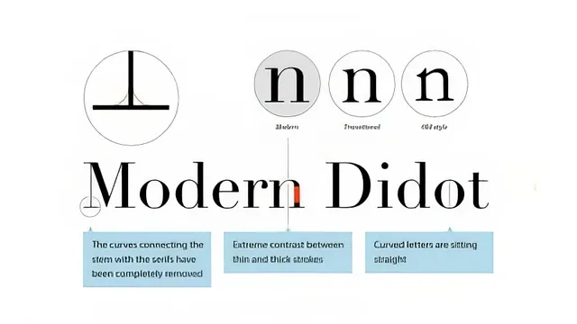
The classification lessons are the backbone. Serifs are split into old style, transitional, modern, and slab serif, each tied to a rough historical period and a set of visual tells, like the bracketed serifs and angled stress of old style faces such as Garamond, versus the hairline strokes and vertical stress of modern faces like Bodoni and Didot. Sans serifs get the same treatment across humanist, grotesque, and geometric categories. None of this is exhaustive, and the course says so, but it gives a learner enough pattern recognition to look at an unfamiliar typeface and place it, which is the actual point.
The strongest stretch is the methodology section, where the course borrows a wardrobe metaphor: choosing a typeface is like choosing an outfit for an occasion, with reliable "workhorse" faces for everyday use and more expressive display faces reserved for the equivalent of a party. It is a small trick, but it reframes a subjective decision into a checklist of questions about the project's reading length, mood, and available space, and it is the kind of thing a beginner can actually apply without a design background.
Where the technical detail pays off, and where it runs thin
The spacing lesson is the most technically dense part of the course, and it earns that density. It separates kerning from tracking clearly, explains why body text should rely on a typeface's built-in kerning pairs rather than optical kerning, and walks through the exact InDesign menu path for switching numerals from lining to old style figures. This is the one section where the course stops being conceptual and becomes a demonstrable skill.
The type crimes lesson, covering stretched type, pseudo-bold and pseudo-italic, vertical text stacking, and prime marks misused for quotation marks, works well as a quick-reference checklist, though each item gets only a sentence or two before moving on. The same pace problem shows up in the display type and combining-typefaces lessons: the eight tips for mixing typefaces are genuinely useful, but each lands as a single line rather than a worked example, so a viewer has to extrapolate rather than watch the principle applied to a real layout.
That compression is the course's central tradeoff. It respects the learner's time and never pads runtime, but the pace means most lessons introduce a concept and move on before it has fully sunk in. There is no project to build, no file to follow along with beyond the spacing demonstration, so retention depends on the viewer's own note-taking. The closing reading list, pointing to Ellen Lupton's "Thinking with Type" and Erik Spiekermann's "Stop Stealing Sheep," is a fair acknowledgment that this course is a starting point rather than a destination, and it hands off the deeper study to sources built for it.
The standout
The wardrobe analogy for typeface selection, borrowed from Ellen Lupton's writing, turns an abstract design decision into a repeatable question anyone can apply immediately.
What you will learn
- How to classify typefaces by anatomy and historical category (old style, transitional, modern, slab serif, and the three sans serif families)
- A practical framework for choosing a typeface based on project constraints like reading length, mood, and available space
- Eight concrete rules for combining multiple typefaces in one project without clashing
- How to manually kern, track, and set old style numerals in InDesign, including the exact menu path
- How to judge line length, leading, and rag shape for readable paragraphs
- A checklist of common typography mistakes (type crimes) like stretched type, pseudo-italics, and prime marks used for quotes
Best for: A working graphic designer or design student who already touches Photoshop or Illustrator daily but has never had formal typography training and needs the vocabulary and decision framework fast.
Skip it if: Anyone wanting deep typeface history, type design or font creation skills, or a slow, example-heavy walkthrough rather than a rapid-fire overview.