
Typographic Logos: Typography and Lettering for Logo Design
Ray Dombroski
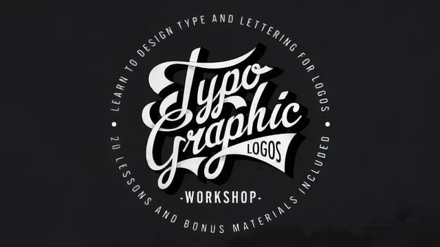
A working graphic designer walks through his exact process for building one hand-lettered logo from sketch to finished vector art with texture and color.
One designer's process, start to finish
This course does not try to teach typography as a subject. It teaches one designer's personal method for turning a hand sketch into a finished, textured, color-separated logotype, and it does that narrowly and specifically. Ray Dombroski, a working graphic designer whose client list includes O'Neill and Billabong, opens with a short glossary distinguishing a font from a typeface, lettering from a logotype, and a logotype from a logo mark, using the Coca-Cola wordmark and the Nike swoosh as the reference points. From there the course moves quickly into the two things it actually cares about: how much this kind of work pays, and how to build one logo from nothing.
The pricing section is a nice, concrete touch that most design tutorials skip. It cites the Paul Rand and Steve Jobs NeXT logo story alongside the famous $35 Nike swoosh, and gives rough dollar ranges for t-shirt graphics versus corporate identity work. It is a short digression, not a business masterclass, but it grounds the craft content in a real market.
The middle stretch on inspiration is honest about a genuinely tricky subject: when is referencing another designer's style tribute, and when is it theft. The rule offered, roughly "if the person you copied would be mad, don't do it," is not rigorous, but it is a workable gut check, and the accompanying tour of the instructor's Pinterest board shows what a working mood board actually looks like rather than just describing one in the abstract.
The production sequence is where the value sits
The back half is the reason to take this course. Dombroski photographs a rough paper thumbnail with his phone, drops it into Illustrator at low opacity, and types an existing script typeface over it purely as a proportion and spacing guide before hand-drawing new letterforms on top. That single workflow trick, using a real font as scaffolding rather than a final answer, is worth noting on its own.
The shading and 3D sections are the technical core. The knife tool separates overlapping strokes so one part of a letter can sit in front of another, the divide tool splits self-overlapping shapes into workable pieces, and half-tone gradients get pasted behind cut sections to simulate shadow. The 3D pass builds on the blend tool to auto-generate intermediate strokes, then walks through manually closing the resulting serrated edges into clean, printable vector shapes, a step many tutorials skip because it is genuinely tedious.
The final stretch on colorways and texture is more mechanical but still useful: separating a lettering job into flat color layers so it survives screen printing, then distressing it with black-and-white bitmap TIFFs in Illustrator or layer-masked Photoshop brushes for a vintage crack-and-grunge look.
Where it falls short
The course assumes real fluency with Illustrator's pen, knife, divide, and blend tools going in. A true beginner will get lost during the shading and 3D sections, where steps move fast and depend on prior muscle memory with the software. It is also narrow by design: there is no coverage of kerning theory, no discussion of building a full brand system around the logo, and no client-revision process. Anyone wanting a broader typography education should look elsewhere. But for what it sets out to do, hand one designer's actual production pipeline to another intermediate designer, it delivers.
The standout
The overlap-shading technique, where the knife and divide tools slice a letterform into pieces that get shifted forward and back with pasted-in half-tone gradients to fake dimensional shadow, is a genuinely reusable Illustrator trick worth the price of admission alone.
What you will learn
- How to tell apart a font, typeface, lettering, logotype, and logo mark, and when to use hand-drawn versus vector-clean lettering
- How to build a mood board from Pinterest references and translate borrowed inspiration into an original composition without copying it outright
- How to move a hand-drawn thumbnail into Illustrator by tracing over an existing typeface as a proportion guide, then redrawing custom letterforms over it
- A layered method for adding overlap shading in Illustrator using the knife tool, the divide tool, and half-tone gradients cut and rearranged behind the letters
- How to fake a 3D extrusion with the blend tool, then manually clean up the serrated edges into flat, print-ready vector shapes
- How to add vintage distress and grunge texture using black-and-white bitmap TIFFs in Illustrator and layer-masked Photoshop brushes
Best for: Intermediate Illustrator and Photoshop users who already know their way around the pen tool and want a real production workflow for hand-lettered logotypes, not beginners still learning the software.
Skip it if: Anyone hoping for a broad typography or branding-strategy course, or a true beginner who has never used Illustrator's pen, knife, and blend tools before.