
Type as Image: Draw and Hand-Letter Your Favourite Animal
Evgeniya & Dominic Righini-Brand · Graphic Design & Photography
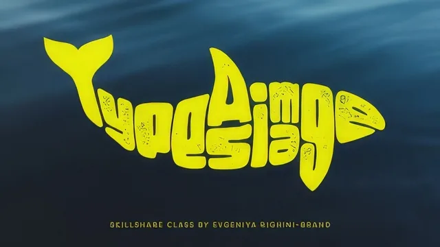
A single hand-lettering trick, taught in under half an hour, with almost nothing standing between you and finished wall art.
A tight, single-technique class
Evgeniya Righini-Brand teaches one method here, tracing an animal's silhouette and hand-lettering words inside it, and she moves through it briskly across nine short lessons. The class opens with a straightforward pitch: pick an animal that means something personal, choose a photograph with a clean, recognizable silhouette, and roughly plan your text before printing the source image at a size that fits your letter count. That planning step matters more than it first appears, since the whole project depends on having enough room inside the shape for the words you intend to fit.
The materials list is refreshingly minimal: a couple of pencils, a marker or fineliner, plain paper, and either tracing paper or a light box. For anyone without those extras, the course includes a genuinely useful workaround, making homemade carbon paper by covering the back of a printed image with dense pencil hatching, then using a ballpoint pen to press the outline through onto a fresh sheet. It is a small, practical piece of craft knowledge that costs nothing and removes a common barrier to starting.
The lettering method itself is the substantive part of the class. After tracing and cleaning up the animal outline, the shape gets divided into sections, one per letter, with attention paid to how wide letters like M and W need more room than narrow ones like I or J. From there, letters are built as solid blocks with negative space carved out to form legible characters, echoing the animal's own contours, curves near a tail, sharper angles near feathers, so the lettering feels stitched into the creature rather than pasted on top. This block-and-subtract approach to letterforming is a real technique, not just a tracing exercise, and it is the one idea in the class most likely to stick with a student afterward.
Where it thins out
Once the inked composition is done, the course pivots to digitizing it, covering Adobe Capture's shape-scanning tool and Illustrator's Image Trace panel at a fairly brisk clip, then closing with Photoshop tricks for gradient maps and texture overlays. These sections move quickly and assume a viewer already has some comfort with Adobe's interface; someone with zero exposure to these apps will likely need to pause and hunt for menu items rather than follow along smoothly. The class does state upfront that all of this is optional and that a purely handmade result is a legitimate finish, which is honest framing, but it means roughly a third of the runtime is software-dependent for anyone who wants the full picture.
At 23 minutes total, there is no room for troubleshooting common problems, no discussion of what to do if a chosen animal's silhouette turns out too complex to read clearly, and no exploration of composition variety beyond the one whale example used throughout. It teaches exactly one project end to end and does that well, but it is a starting point rather than a deep well of lettering instruction. Students who finish it and want to keep developing the technique will need to practice on their own animals to build real fluency with the negative-space approach.
The standout
The negative-space letterforming method, blocking out solid shapes and subtracting letter elements from them, is a transferable lettering skill worth the class on its own.
What you will learn
- How to pick a source image whose silhouette reads clearly as an animal from shape alone
- How to make homemade carbon paper by graphite-covering the back of a printout for tracing without special materials
- How to divide a traced outline into letter-sized sections and sketch letterforms as negative space cut from solid blocks
- How to refine loose pencil sketches into a clean inked composition with a marker or fineliner
- How to digitize the finished piece using Adobe Capture's shape-scanning tool or Illustrator's Image Trace panel
- How to push a digitized design further with gradient maps, texture layer masks, and blend modes in Photoshop
Best for: Beginners and hobbyist lettering fans who want a low-cost, low-skill weekend project that yields a shareable finished piece.
Skip it if: Experienced letterers or illustrators looking for rigorous typographic theory, anatomy instruction, or advanced digital-vectorizing technique.