
Think Like a Designer: Making an Art Poster
Chip Kidd · Graphic Designer at Alfred A. Knopf
A quick, elegant look inside Chip Kidd's process for one real poster, more inspiration than instruction, but sharp on how concept beats decoration.
A process, narrated, not taught
This class follows Chip Kidd through one real assignment: an art poster for the Brooklyn Book Festival, produced pro bono in 2016. Kidd spends the first two lessons framing the problem the way an art director actually would. The festival had a logo and a program full of dates and schedules, but no standalone image, so its only real deliverable was an atmosphere, not a message. That distinction, between typographic information and pure image, sets up everything that follows and gives beginners a genuinely useful frame for thinking about what a poster is even for.
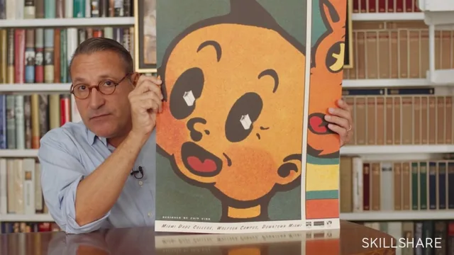
The middle section is the strongest stretch of the course. Kidd walks through two earlier posters, for the Miami and Boston book festivals, not as a victory lap but as working case studies in how a designer builds a personal reference library. The Miami poster used cropped comic panels to suggest a fair too big to contain; the Boston poster wrapped a map of the city around a physical book. Both examples exist to show why the Brooklyn poster needed a different solution: the client already had a name and logo, so the image alone had to carry the idea of "books" and "Brooklyn" at once.
The lesson on form is where the class gets closest to a repeatable technique. Kidd describes searching for a shape that could stand for two things simultaneously, landing on the Brooklyn Bridge's cable span as a visual echo of an open book. He is candid that a strong mental image does not guarantee a working poster, and that some ideas need to be built out just to be discarded. That honesty about failed direction is more instructive than most of the polished case studies designers usually present.
Where the process gets tested
The photography lesson briefly widens the scope with two unrelated posters, for the Wolfsonian museum and an Adobe scholarship program, to argue that photography reads as more real while illustration reads as more inventive. It is a fair point but a short detour, and it leans on finished examples rather than showing the choice being made in real time.
The final field-testing lesson is the closest the course comes to a demonstration. Kidd shoots the bridge, builds a mockup book jacket from the photos, then takes that mockup back into a Brooklyn neighborhood to photograph it against real storefronts and graffiti. The moment an elevated train's track angle happens to match the bridge cables already chosen becomes the poster's final image, and Kidd uses it to make a real point about staying open to accidents a plan cannot anticipate.
What the course does not offer is any technical instruction. There is no camera setup, no Photoshop walkthrough beyond a passing mention of converting to CMYK, and no typography lesson at all, despite typography being part of the stated assignment. Beginners hoping to learn poster-making as a craft will finish with a way of thinking, not a set of skills. Anyone drawn to the more design school framing in the blurb, evaluating concepts, testing ideas on the ground, will get real value in just over half an hour. Anyone expecting to build a poster alongside Kidd will need to look elsewhere for the execution.
The standout
The account of finding the poster's final image by accident, when a train track's V shape unexpectedly echoed the Brooklyn Bridge cables already chosen, shows how field testing can improve on a plan made at a desk.
What you will learn
- How to define a design problem by identifying what a client already has (a logo) versus what they lack (an image)
- How physical constraints, like a fixed 14 by 22 inch poster size for storefront display, shape creative decisions from the start
- How to research past solutions to similar problems (Miami and Boston book festival posters) to avoid repeating yourself
- How to build a visual metaphor by finding a shared form between two unrelated things, like a bridge and a book
- When to choose photography over illustration based on the emotional weight the image needs to carry
- How to test a concept on location, then let unplanned discoveries reshape the final image
Best for: Design-curious beginners and students who want to see how a working professional thinks through a real assignment from problem to finished image.
Skip it if: Anyone wanting hands-on Photoshop, typography, or layout instruction, since the class stays almost entirely conceptual and shows no software work.