
The Style Class: Work Out Your Illustration Style in a Daily Project
Tom Froese · Illustrator and Designer
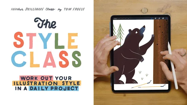
A structured, philosophy-first approach to illustration style that trades quick tricks for a 26-day project designed to reveal your own visual instincts.
A Primer Before the Project
Tom Froese opens with roughly a third of the runtime on theory before any drawing happens, and that ordering is deliberate. The primer section walks through what style actually is (the visual, sensory layer that hits before the intellect), why it matters commercially (as brand identity and as a problem-solving tool), and the three pain points that keep coming up in student questions: consistency, confidence, and originality. Froese's answer to the consistency question is refreshingly non-prescriptive. He argues illustrators can succeed with either one narrow style or several, and that the real goal is having recognizable pivot points clients can depend on, not forcing yourself into a single signature look before you're ready.
The confidence and originality sections lean more into mindset than mechanics, built around his recurring "three I's" model: inspiration, imitation, innovation. The claim that every illustrator starts by copying heroes and gradually shifts toward referencing their own earlier work is a reasonable way to normalize the imitation phase, though it stays a level of abstraction above anything actionable. Students hoping for concrete diagnostic exercises this early will need to wait.
From Theory to a 26-Day Project
The course earns its keep in the second half, where the abstractions turn into a specific pipeline. Froese details his own reference-gathering habit: creating a folder per illustration subject and deliberately searching Google Images rather than Pinterest, because Pinterest results are already taste-filtered by other curators and he wants raw, unbiased visual information instead. He then walks through observational sketching (drawing straight from references with no interpretive agenda), followed by a refined sketch pass aimed at getting a concept clear enough that a client would understand it without explanation.
The centerpiece is a 26-day alphabet project: pick a theme, pick a technique, and illustrate one word per letter, A to Z. Before committing to the whole set, Froese has students build a pilot set of 3 to 5 pieces mixing simple representational subjects with harder conceptual ones, which surfaces technique problems early rather than 20 illustrations in. He demonstrates the full pipeline on his own trail-running theme, taking a "lost hiker in the forest" concept from reference photos through a refined sketch to finished Photoshop art, narrating brush choices, layer blend modes, and how he handles hair, packs, and lettering-adjacent texture work along the way.
The lettering lesson is a smaller but genuinely useful detour, arguing that illustrators need only one consistent hand-lettering approach, not a whole type library, and pointing to how Andy J. Pizza, Kate Bingaman-Burt, and Louise Lockhart each lean on a single recognizable lettering voice.
Where It Falls Short
The course is honest about its own limits: Froese admits partway through that he has only completed his pilot set, not the full 26-day alphabet, at the time of teaching. That transparency is appreciated, but it also means the class project demo never shows the payoff of finishing a full set, the exact experience students are being asked to commit weeks to. Anyone wanting tool-specific tutorials, on Procreate, Photoshop brush setup, or color theory, will find those referenced only in passing, since Froese is explicit that specific techniques are outside the scope. This is a course about the thinking behind style, not the hands-on execution of any one style, and it delivers well on that narrower promise.
The standout
The pilot-set method, where a small batch of 3 to 5 illustrations covering both representational and conceptual words is completed first to lock in a workable style before committing to the full 26-day set.
What you will learn
- How to distinguish the two main pain points behind style anxiety: consistency, confidence, and originality, and reframe each one
- A framework for moving from imitation through inspiration to a more personal, referential way of working
- How to build and use a personal reference-gathering system (folder structures, deliberately unfiltered Google image searches instead of curated Pinterest boards)
- How to develop a consistent hand-lettering approach as a style anchor, even without formal type training
- A full production workflow from preliminary observational sketches through refined sketches to finished art, demonstrated on a real illustration
- How to plan and execute a 26-day alphabet-based illustration project built around one theme and one technique
Best for: Working or aspiring commercial illustrators who already have basic drawing and digital tool skills and want a structured, multi-week project to pressure-test and clarify their style.
Skip it if: Complete beginners looking for step-by-step technique tutorials on drawing, coloring, or specific software tools, since this class deliberately stays in the conceptual and process layer.