
The FULL Logo Design Process Step By Step
Lindsay Marsh · Over 500,000 Design Students & Counting!
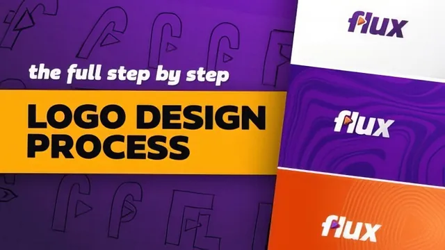
A structured 10-step logo design walkthrough for people who already know Illustrator but not how to run a real client process.
A process course, not a tools course
This class does not teach Adobe Illustrator. It assumes a working knowledge of the pen tool, direct selection, shape builder, and basic path operations, then spends its 93 minutes on something most logo tutorials skip: the actual decision-making process a designer runs through on a paid client job. The course is built around a fictional client brief for a short-form video app called Video Flux, and every lesson traces back to that single brief, from the first pencil sketches to the final zipped folder of export files.
The structure follows a 10-step worksheet, and the course sticks to it closely. Brainstorming and sketching come first, including a demonstration of sketching on paper versus in Procreate, followed by vectorizing those sketches in Illustrator using the pen tool, image trace, and a technique of borrowing a base font and reshaping its letterforms by hand to fix inconsistent stroke contrast. The manual type-adjustment lesson is the most hands-on section, walking through eliminating anchor points, using the curvature tool, and aligning characters to a baseline and cap height to fix a lettering concept that started out uneven and amateurish.
Where the course earns its keep
The strongest material is the flexibility testing in "Picking your Final Concept." Two logo directions get shrunk down, boxed into a square app icon, and tested in isolation as a standalone mark, which exposes real problems, like an F that reads as an upside-down J once it loses its full context. This is the kind of practical filtering that separates professional logo work from just picking a favorite sketch, and it is demonstrated concretely rather than described abstractly. The grid work lesson that follows applies the same rigor to spacing and alignment, using offset paths and guide lines to justify placement decisions to a client rather than eyeballing them.
The color and presentation sections are similarly grounded in real practice: naming colors, logging hex and CMYK values, testing a palette against light and dark backgrounds, and the reminder to never show more than one concept per presentation page because it causes client hesitation. The exporting lesson is blunt and useful about the unglamorous reality of the job, noting that a single logo package can produce over 50 files across vector, web, and print formats, and that getting client approval before exporting saves hours of rework.
Where it thins out
The course runs short at 93 minutes for a process this dense, and it shows in a few places. The color exploration and effects sections move quickly through decisions that would benefit from more explanation of why one palette or gradient was chosen over another, rather than just showing the result. The included Illustrator worksheet and presentation template are clearly meant to carry some of the teaching load outside the video content itself, which works but means the video alone is not fully self-contained.
Overall this is a well-organized, honestly practical course for its stated intermediate audience. It will not teach someone Illustrator, and it does not pretend to, but for a designer who already has the tool skills and wants to see a coherent client-facing workflow modeled from brief to delivery, it delivers real value in a short runtime.
The standout
The flexibility-testing phase, where the logo is shrunk, boxed into a square app icon, and stripped to a single mark to see which concept actually survives real-world constraints.
What you will learn
- How to structure a client brief into a working creative direction
- Sketching and rapid iteration techniques before touching Illustrator
- Vectorizing hand sketches using the pen tool, image trace, and base-font manipulation
- Manually adjusting type by hand to remove inconsistencies in stroke weight and character shape
- Using a grid system to set spacing, alignment, and proportion across a logo
- Testing a logo's flexibility across square, horizontal, and vertical formats before finalizing it
Best for: Designers who already know their way around Illustrator's pen and shape tools and want to see a full, realistic client-facing logo workflow rather than software basics.
Skip it if: Complete beginners to Illustrator or anyone wanting a quick logo template, since the course assumes working tool fluency and moves through a slow, detail-heavy process.