
Sweet Spots: Expressing Big Ideas in Small Editorial Illustrations
Tom Froese · Illustrator and Designer
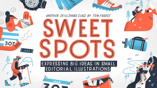
A working illustrator breaks his own concept-to-style pipeline into named frameworks, then proves it on two real spot-illustration sets.
A vocabulary for the thing illustrators can't usually explain
Most illustration classes teach a technique. This one teaches a way of thinking, and it does so by giving names to things experienced illustrators do intuitively but rarely articulate. Tom Froese, a freelance illustrator whose client list includes The Wall Street Journal and Airbnb, spends the first third of the course building a shared vocabulary: concept as "a visualization of an invisible or abstract idea," style as how that concept looks once it is paired with execution, and the spot illustration itself as a small, self-contained image built to carry one idea rather than several. The truck-versus-Volkswagen-Golf analogy for load capacity is a small but genuinely useful mental model, and it recurs implicitly through the rest of the course every time a sketch gets simplified.
The primer section is the strongest part of the class. The five elements of style (shape, line, color, texture, shading) function as a checklist you can run against your own unfinished work, and the advice inside each one is concrete rather than aspirational: shapes split into geometric, organic, and abstract; color gets a hard constraint of three to six hues sourced from something you already love rather than invented from color theory; texture is framed honestly as a way to fake the warmth of physical media inside a vector-based process. The five principles of design that follow (repetition, pattern, balance, grouping, contrast, hierarchy) do the same job at the level of a whole set rather than a single image, and the grouping principle, explained through a comparison to a cluttered kitchen sink, is a memorable way of describing something that's usually just called "composition." The FACES acronym for stylization (flattening, abstraction, contour, exaggeration, simplification) closes the primer and gives students a five-step lens for pushing any reference photo toward an iconic, non-realistic mark.
Where the project earns its keep
The back two-thirds of the course is a live demonstration of the primer, not a repeat of it. Froese researches, thumbnails, and finalizes two sets of running-themed spot illustrations, one built from simple objects (a GPS watch, a race bib, a water bottle) and a second built from abstract concepts (mental battles, chafing, elevation training). Watching him choose between competing thumbnails is where the course delivers its real value, because he narrates the actual criteria: does the concept read instantly, does the sketch translate into his flat style, and does it hold together next to the other pieces in the set rather than as an isolated image. His running commentary on small decisions, like deciding safety pins can be rendered as two simple lines rather than literal hardware, or catching that his shapes habitually lean rightward and correcting for it, models the kind of self-editing that's hard to teach through instruction alone.
The course is honest about its limits. Froese states outright that this isn't a software tutorial and that viewers should translate his methods rather than his exact keystrokes, which means anyone hoping for a step-by-step Photoshop or Procreate walkthrough will be disappointed. The pacing also assumes a viewer who already draws competently. There's no instruction on basic figure construction, perspective, or line confidence, so a true beginner will struggle to keep up once the sketching sections begin. At 239 minutes across seventeen lessons, the class also runs long for what is ultimately a single core insight (concept and style are decisions, not talents), though the two-project structure does make that insight land twice, in two different registers, which is what makes it stick.
The standout
The five elements of style, especially the breakdown of shape (geometric/organic/abstract) and the instruction to restrict any palette to three to six colors chosen from a source you already love, gives a repeatable answer to 'how do I find my style' that most illustration classes leave vague.
What you will learn
- How to define and defend a concept before touching color or line
- The five elements of style (shape, line, color, texture, shading) as a working vocabulary
- The five principles of design (repetition, pattern, balance, grouping, contrast, hierarchy) used to unify a set
- The FACES framework for stylization: flattening, abstraction, contour, exaggeration, simplification
- How to run research and discovery into thumbnail sketches, then refine and finalize a themed set
- How to judge a set for stylistic consistency rather than judging images one at a time
Best for: Illustrators with existing drawing chops in Procreate, Photoshop, or physical media who already ship work but struggle to explain their own concept and style decisions.
Skip it if: Total beginners with no illustration fundamentals yet, or anyone wanting a software tutorial, since Tom Froese explicitly says this is not a Photoshop course and skips tool-specific instruction.