
Storytelling Through Lettering: Exploring Different Styles
Martina Flor · Lettering Artist, Author & Educator
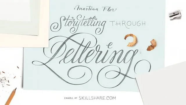
A short, focused primer on the storytelling logic behind eight lettering styles, not a copy-and-trace tutorial.
Martina Flor's class is less a drawing tutorial than a way of thinking about letters, built around a single premise stated early on: every lettering piece carries both a literal meaning (the text) and a formal meaning (what the shapes themselves communicate). The whole 65 minutes is organized around teasing those two apart and then reuniting them on purpose.
Structure and pacing
The course opens with two case studies, book covers for Walker Books and Penguin Random House, that show how a Victorian-era composition or a hardboiled thriller mood gets translated into specific letter choices. From there it moves into a short but genuinely useful lesson on building a personal image library, pointing to physical ephemera like flea-market magazines and tin can packaging alongside digital sources such as archive.org's chromatic type specimen scans and niche Flickr galleries devoted to sugar packaging and speedball lettering manuals. This section is oddly one of the strongest in the class: it is a concrete, repeatable research habit rather than vague encouragement to "find inspiration."
The core of the course is a tour through eight style families: serif, sans serif, 3D, script, brush, fraktur, funky, and decorative. Each gets the same treatment. Flor sketches the word "draw" live, explains the underlying mechanism (a pointed nib gives thin high-contrast serifs, a flat nib produces fraktur's broken angular joints, a pointed brush thickens on the downstroke and thins on the release), and then shows two or three quick variations built from that one principle. The 3D section is the clearest example of teaching a transferable method: rather than showing a finished extruded letterform, it walks through choosing a vanishing point versus an axonometric projection, and deciding whether the viewer stands above or below the horizon line, since that decision alone flips the volume and shadow to the opposite side of the letter.
What holds up and what doesn't
The strength of the class is that it never asks you to copy a template. Funky and decorative lettering, in particular, are framed as small parametric decisions, shortening the upper body, reversing which strokes carry contrast, adding an inline instead of a full shadow, that can be applied to any letterform already in a sketchbook. That reframing is genuinely more useful long-term than a style-specific how-to.
The limitation is pacing and depth. Eight styles in roughly 40 minutes of instructional content means each one gets only a couple of minutes and a single rough sketch, so nothing is refined to a finished state. Script lettering and brush lettering are explicitly treated as previews, with Flor pointing viewers toward her other Skillshare classes for the full method. The final project, a lettering cover for a personal sketchbook, is left open-ended with no rubric or example beyond "choose a word and try a couple of styles."
This is a strong orientation course for someone who already sketches letters and wants a mental model for switching between styles deliberately, but it is not a from-scratch lettering course, and anyone expecting finished, camera-ready pieces or detailed refinement techniques will need to look at Flor's other classes to get there.
The standout
The explanation of the pointed-brush push-and-release rhythm, and how understanding that mechanical logic lets you draw convincing brush lettering by hand even without calligraphy training.
What you will learn
- How to build a personal reference library of lettering inspiration from physical objects, archive.org, and Flickr
- The structural logic behind serif, sans serif, script, brush, fraktur, and blackletter forms rather than fixed templates
- How to add volume and shadow to letters using perspective and axonometric projection with a consistent light source
- How subtle proportion shifts, such as shortened bowls or exaggerated stems, create funky or decorative variations
- How to connect a letter's shape to the emotional tone of a project through historical and stylistic reference
- How to sketch loosely and iterate across multiple style directions before committing to a final piece
Best for: Letterers or illustrators who already sketch letterforms and want a conceptual framework for shifting between styles deliberately rather than by habit.
Skip it if: Complete beginners looking for step-by-step alphabet tracing or a polished digital-finishing tutorial, since this class stays in rough-sketch territory and assumes some drawing comfort already.