
Stage the Perfect Instagram Flat Lays to Showcase Your Art
Peggy Dean · Top Teacher | The Pigeon Letters
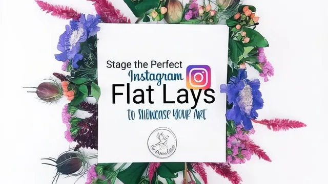
Seventeen minutes of specific staging and lighting fixes for artists who already shoot flat lays but can't figure out why theirs look flat.
Peggy Dean's flat lay class is exactly as long as it needs to be and not a minute longer, which is both its strength and its ceiling. In under 17 minutes, spread across nine short lessons, it moves from lighting fundamentals to three staging styles to brand outreach to phone editing, never lingering long enough to feel padded but never digging deep enough to feel thorough either.
The lighting segment is the strongest stretch of the course. Rather than a generic "use natural light" tip, Dean walks through four concrete fixes for uneven shadows: propping up a poster board to bounce light onto a dead corner, slipping a thin object like a marker or a rock under a sagging edge of paper, bringing a lamp in close to fill a shadow, and simply rotating or repositioning the paper itself to find better light. That last point, that repositioning is often the fastest fix and should be tried first, is the kind of practical sequencing that separates a useful tutorial from a list of tips.
Staging styles
The three staging approaches, minimalist, creation-supplies, and nature, are less a system than a set of starting points. Minimalist gets the most interesting treatment, with the idea that swapping a background color or texture (grass, wood, solid paper) changes the emotional read of the same single object. Creation-supplies is essentially a checklist: envelopes, ribbon, washi tape, pens with caps removed, a messy paint palette. Nature leans on the instructor's own preference for foraged leaves, twigs, and trimmed flower stems tucked under an art piece's edges. None of these get more than two or three minutes, so they read more as prompts to experiment with than as fully demonstrated techniques.
Where it thins out
The brand-outreach lesson is the most tactically specific part of the course outside of lighting: tag the brand's own hashtag (often found in their bio), tag them in the caption, and tag them directly in the photo itself, since large accounts often miss caption mentions in a flooded notification feed but do check photo tags separately. That is useful, concrete advice for anyone trying to get noticed by an art supply company or similar. But the editing portion that follows is thinner. The exposure, black point, and color temperature workflow is sound advice about avoiding the washed-out look of over-brightening, but it is described in a sentence or two rather than walked through step by step, and the same is true of the app recommendations, which amount to naming a couple of favorite filters rather than demonstrating an edit.
The overall arc makes sense for its short runtime: light the shot, build the composition, get it seen, finish the edit. But the course is really a checklist of things a working Instagram artist has picked up over time, delivered efficiently rather than taught in depth. Anyone who has already been posting flat lays and hitting inconsistent results will find several fixes worth trying immediately, particularly around lighting and brand tagging. Anyone hoping for camera settings, a slower composition breakdown, or an actual screen-recorded edit will find the pace too brisk to call it instruction.
The standout
The four-step shadow-fixing breakdown, poster board bounce, propped paper corners, close-range lamp fill, and re-angling, gives a genuinely actionable fix for the single most common flat lay flaw.
What you will learn
- How to diagnose and fix uneven shadows using poster board, propping tricks, and paper repositioning
- Three distinct flat lay compositions: minimalist single-object, creation-supplies process shots, and nature-based props
- How to tag and hashtag brands correctly so posts surface in their notifications instead of getting buried
- A phone editing sequence using exposure, black point, and color temperature instead of stacked filters
- Two specific photo apps (Color Story and VSCO) with named filter presets to start from
Best for: Instagram-active artists who already photograph their work flat but get inconsistent lighting or flat, cluttered compositions.
Skip it if: Anyone needing camera fundamentals, a real editing tutorial with app walkthroughs, or brand outreach strategy beyond hashtag tagging.