
Source & Mix Botanical Illustrations with Typography to Create Trendy Designs
Evgeniya & Dominic Righini-Brand · Graphic Design & Photography
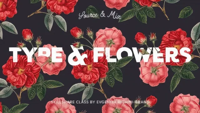
A tight, well-paced 24-minute masking and color-variant workflow, but it assumes you already know Photoshop cutting and type basics.
This class is short by design, and it mostly earns that brevity. In under half an hour it walks through a single, complete workflow: source a vintage botanical illustration, cut it apart, arrange it with type, mask the two together for a layered look, generate color variants, and prep the result for print. For anyone already comfortable in Photoshop, that arc is efficient and genuinely useful.
What the class actually teaches
The sourcing and cutting lesson is the most procedural stretch, covering how to duplicate a source layer before cutting, separate a single illustration into individual elements (a flower, a few buds, some leaves), and save each as its own file for later use. This groundwork pays off in the masking lesson, where those separated pieces get reused to build selections that control exactly which parts of the type sit behind the illustration and which sit in front. That technique, command-clicking a leaf or petal layer's thumbnail to load a selection, then painting black onto the type layer's mask within that selection, is the closest thing the class has to a signature move. It's a simple idea explained clearly, and it's the one technique that actually produces the layered, dimensional effect the course promises.
The color variants lesson is the second strong stretch. It introduces Photoshop Artboards as a way to duplicate an entire composition and test different palettes without destroying the original, then layers in opacity changes, Hue/Saturation adjustment layers linked to specific groups, and Gradient Map adjustments for tinting. None of this is exotic, but showing how to target an adjustment layer at just the illustration, just the background, or the whole artboard is a practical distinction that a lot of tutorials skip.
Where it thins out
The type lesson is the weakest link. It introduces the Match Font feature, a legitimately interesting tool for identifying a typeface from a reference image, but spends almost no time on why a particular typeface or pairing was chosen beyond "it creates contrast." The class openly defers typeface selection and pairing fundamentals to the instructor's other typography course, which is a reasonable choice for scope but means viewers without that background will follow the steps without understanding the reasoning behind them.
The print preparation section, covering canvas doubling for a foldable card, adding bleed, and manually drawing crop marks with the rectangular marquee and stroke command, is thorough but dense for its short runtime. It's the kind of segment worth pausing and replaying rather than watching straight through.
Overall, the class delivers exactly what its title promises and nothing more. It isn't padded, but it also isn't self-contained. Treat it as a focused technique add-on to the instructor's Photoshop basics and typography classes rather than a standalone introduction to either.
The standout
The masking technique, using command-click selections from pre-cut illustration layers to paint precise transparency onto a type layer's mask, is the one move that actually creates the class's signature layered depth effect.
What you will learn
- Sourcing copyright-safe vintage botanical images and cutting them out with the polygonal lasso tool
- Separating a cut illustration into individual layered elements (petals, leaves, buds) for flexible arranging
- Building layer masks with selections pulled from the illustration's own layer thumbnails to create a layered, dimensional look
- Using Photoshop's Match Font feature to identify and substitute typefaces from a reference image
- Generating multiple color variants efficiently using Artboards, opacity, Hue/Saturation, and Gradient Map adjustment layers
- Preparing a folded card for print with canvas doubling, bleed, and manually drawn crop marks
Best for: Designers who already know Photoshop's cutting, layering, and type tools and want a fast, focused method for combining botanical imagery with typography.
Skip it if: Total Photoshop beginners or anyone who hasn't yet learned basic typeface pairing, since the class explicitly defers those fundamentals to the instructor's other courses.