
Simple Words to Stunning Art: Combine Hand Lettering and Illustration
Gia Graham · Designer, Letterer, Illustrator
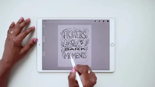
A tight, focused intermediate lesson on layering illustration onto lettering, but only worth it once basic lettering skills are already solid.
Gia Graham's class sits at a narrow but useful intersection: not a lettering class, not a drawing class, but a class about the relationship between the two. It assumes the viewer already letters and already understands basic layout, and spends its 72 minutes entirely on the connective tissue between words and images.
Structure and the three methods
The course is organized with unusual clarity. After a short framing section that defines art as content plus imagination plus implementation, it walks through three named methods, each getting its own trio of lessons: a principles lesson, a brainstorming/sketch lesson, and a final implementation lesson. Lettering primary treats the words as the star and illustration as decoration around them, illustrative lettering fuses the two so letterforms literally become the imagery (roots, vines, flames), and illustration primary flips the hierarchy so a scene carries the message and the lettering is built into it. Working through the same quote, "flowers grow out of the dark moments," in all three methods is the strongest structural choice in the class, because it lets a viewer directly compare how one phrase changes shape under three different logics rather than jumping between unrelated examples.
The through-line concept, that illustration should interact with lettering rather than sit beside it, gets reinforced constantly: flowers wrapping around a bowl of an S, roots growing from the base of letters, flower petals acting as literal containers for split words. That repetition is not padding, it is the actual lesson landing three separate times.
Strengths and limits
The class earns real credit for naming failure modes precisely instead of vaguely. It calls out the mistake of tilting an entire word to follow an angled baseline instead of stair-stepping individual vertical letters, and it distinguishes between an object that can convincingly become a letterform (bacon curving into a B) versus one that cannot (broccoli forced into the same shape). These are the kind of specific, testable rules a student can actually check their own work against, rather than abstract encouragement to "be creative."
Where the class is weaker is in its explicit refusal to teach drawing or rendering technique. Anyone hoping to learn how to actually draw convincing florals, roots, or scenes will find only finished results and brief process narration, not instruction in illustration fundamentals. The color and inking segments are similarly light: a workflow is shown, layer by layer, color test to final ink, but the reasoning behind specific palette choices is often personal preference stated in passing rather than a transferable rule.
The closing lessons on printing and phone lock screens feel like a minor but honest bonus, useful without being essential, and the final admission that these pieces took seven to twelve hours apiece sets realistic expectations rather than overselling how quickly results come. For someone who already letters competently and wants a repeatable framework for making that lettering feel finished, this delivers exactly that. For anyone still building core lettering or drawing skill, it is the wrong starting point, and the class says so itself.
The standout
The lettering-on-an-angle technique, where each letter stair-steps upward and stays vertical even as the baseline tilts, is a small but genuinely useful correction to a common beginner mistake.
What you will learn
- How to categorize and apply three distinct methods for combining lettering and illustration: lettering primary, illustrative lettering, and illustration primary
- How to brainstorm and thumbnail a layout that balances legibility with decorative elements like florals, flourishes, or scene-building
- How to plan and execute a cohesive color palette using a color test layer before inking
- How to split words across an illustration while preserving reading order and legibility
- How to letter on an angled baseline while keeping individual letterforms vertical
- How to take finished digital artwork from Procreate to a printed poster or phone lock screen
Best for: Letterers and illustrators who already have solid basic lettering and layout skills and want a structured framework for adding decorative or illustrative elements without overwhelming their compositions.
Skip it if: Complete beginners to hand lettering or digital drawing, or anyone hoping to be taught how to draw or render illustrations from scratch.