
Screen-Printing Grain Effect in Adobe Photoshop
Evgeniya & Dominic Righini-Brand · Graphic Design & Photography
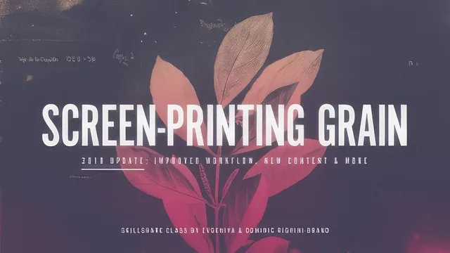
A tight 50-minute Photoshop tutorial that builds one specific non-destructive grain effect using stock filters, not a general design course.
A single effect, built and rebuilt
This course does not try to teach Photoshop broadly. It teaches one repeatable effect: a grainy, torn-edge texture meant to stand in for screen printing, built entirely from two native Photoshop filters, Grain and Torn Edges, stacked together inside the Filter Gallery and applied as smart filters rather than baked into pixels. The arc is logical and short. It opens by explaining which source images will actually work (anything with tonal gradation, photographs, shaded drawings, gradient-based digital art) and which will not (flat-color line art, since the filters need shading to convert into grain density). Then it walks through document setup, image prep, building the effect once, and finally reusing, recoloring and scaling that effect across other images and multicolor compositions.
The construction sequence is the strongest part of the course. The instructor sets the Grain filter to Regular type and tunes Intensity and Contrast for smooth tonal transitions, then layers Torn Edges on top and adjusts Image Balance, Smoothness and Contrast to shape the grain particles themselves. Nothing here is exotic. Grain and Torn Edges are filters most intermediate users have clicked past without a second thought, and the course's real contribution is showing exactly how the two interact and which sliders matter. That is a useful, specific piece of knowledge that a lot of generic "cool effects" tutorials skip in favor of one-shot presets.
Two structural choices lift this above a simple filter demo. First, the Blend If technique for stripping white out of the filtered layer, done by nudging the top-right slider on the gray channel, turns an opaque grainy square into a transparent stencil that can sit over any background or gradient. Second, and more clever, is the resolution trick: the effect lives inside a smart object set to 600 dpi while the master document stays at 300 dpi, so grain size can be scaled up or down later just by changing the smart object's resolution, without touching the effect settings themselves or the master file's dimensions. That single idea, decoupling grain size from output size, is the kind of workflow insight worth the price of admission on its own.
Where it thins out
The coloring section, which covers clipped Solid Color and Gradient fill layers, is competent but not deep. It is the expected non-destructive approach and works, but it does not go much further than "clip a fill layer to your smart object and pick colors." The multicolor composition lesson, which explains duplicating the smart object via "New Smart Object via Copy" (not a simple duplicate) so each color channel can be isolated and recolored independently, is conceptually sound but moves fast and assumes real comfort navigating nested smart objects three levels deep.
The course is honest about its own limits. It flags upfront that CS6 users need a workaround for smart adjustments, and it does not pretend to replace halftone-pattern prep for actual screen printing, positioning itself as a graphic alternative rather than a production method. For an intermediate user who already trusts smart objects and blend modes, the 50 minutes deliver a genuinely reusable technique. For anyone shakier on those fundamentals, the pace and the three-deep nested document structure will likely require rewatching sections more than once.
The standout
Nesting the effect inside a smart object set to a higher internal resolution than the master file, so grain size can be tuned later just by changing that one number.
What you will learn
- How to combine the Grain and Torn Edges filters inside the Filter Gallery as stacked smart filters to fake screen-printing texture
- How to use the Blend If sliders to strip the white background out of a filtered smart object so only the grain remains
- How to color a stylized image non-destructively with clipped Solid Color and Gradient fill layers instead of painting directly on pixels
- How to swap in new source images and re-tune Levels, Grain and Torn Edges settings without rebuilding the effect from scratch
- How to split a composition into separate smart objects to create multicolor, multi-ink-style prints
- How the smart object's internal resolution (independent of the master document's) controls grain size, and how to flatten and export correctly for print or web
Best for: Intermediate Photoshop users, illustrators or print designers who already know layers and smart objects and want one specific reusable textured-print effect.
Skip it if: Photoshop beginners unfamiliar with smart objects and layer blending, or anyone wanting halftone dots, general print-prep, or broad Photoshop skills training.