
Rock Poster Design: From Concept Development to Execution
DKNG Studios · Design + Illustration
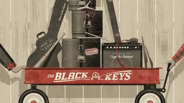
Two working designers walk you through a real concert poster from research to print, though the class leans on live-office-hours filler that thins the actual instruction.
This class comes from DKNG Studios, the two-person team behind a long list of touring-band posters, and it teaches concert poster design the way they actually practice it: research the subject, sketch fast, sketch again, present to a client, refine under a limited color budget, then hand off separations to a printer. That arc is the course's real strength. It is not a class about a single Illustrator technique. It is a walkthrough of a professional process, told by people who have done it for bands ranging from Flight of the Conchords to Phish.
What the course actually covers
The early material is the strongest. DKNG opens by sending students to Pollstar and Ticketmaster to pick a subject, then to Wikipedia, band interviews, and existing album art to build a visual vocabulary before any sketching starts. They point to geekposters.com and OMG Posters as places to see what has already been done for a given band, using The Decemberists as an example of a client who explicitly asked for no birds or trees because that imagery had become a cliché in their fan art. This research-first habit, and the honest acknowledgment that a client's opinion can override a designer's favorite idea, sets a realistic tone that a lot of design classes skip.
The sketching and presentation section is where the course earns its intermediate label. DKNG shows a thumbnail sketch next to its more refined follow-up, then a full presentation PDF built for an actual client (a bluegrass festival), complete with reference imagery and a written concept paragraph. The point that some clients only need a written description, not a drawn sketch, is a useful piece of real-world nuance rarely covered elsewhere.
Composition and color get a compressed but concrete treatment: rule of thirds, negative space, and symmetry are each illustrated with a specific finished poster, and the color discussion turns on a real production constraint, screen printing's limited ink count, solved through overprinting to multiply the effective palette. The typography segment covers a genuinely practical trick: printing a typeface, hand-tracing it with a pen for a wobblier look, then deliberately varying repeated letters so the illusion holds up under scrutiny.
Where it thins out
The course's structure works against it. A large share of the runtime is a recorded live office-hours session, complete with dropped video calls, "can you hear me" exchanges, and long stretches answering audience questions about tumblr galleries and licensing permissions. Some of that Q&A is genuinely useful, particularly the live critique of a student's Victorian-mountain poster concept, but it dilutes the density of instruction per minute. A viewer hoping for a tightly edited lecture series will instead get something closer to a recorded webinar.
The closing client-stories lesson, covering the Flight of the Conchords poster contest and a hundred-film Paramount anniversary piece, is engaging but functions more as background and motivation than as teaching. It adds color to DKNG's career without adding a new skill.
Overall, this delivers real studio knowledge, especially around research, client presentation, and screen-print color thinking, but the live-session format means a student has to work to extract the lesson from the conversation around it.
The standout
The overprinting demonstration, showing how three inks like brown, orange, and teal can be layered to produce a broader palette than the ink count suggests, is a genuinely transferable screen printing technique.
What you will learn
- How to research a band before designing, using tour sites, Wikipedia, album art, and poster archives like OMG Posters and geekposters.com
- How to move from thumbnail sketches to a refined sketch and a client-ready presentation PDF with reference imagery and a descriptive paragraph
- How composition principles like rule of thirds, negative space, and symmetry apply to poster layout
- How screen printing constrains and shapes a color palette, including overprinting to expand a limited ink set
- How to fake a hand drawn look for type, including deliberately varying repeated letterforms so a font doesn't read as a font
- How to organize working files in Dropbox and prepare final separations for a printer
Best for: An intermediate illustrator or graphic designer who already has basic Illustrator skills and wants a portfolio piece plus exposure to how a working studio handles concept, client feedback, and print production.
Skip it if: A beginner with no drawing or vector software experience, or anyone wanting a tight, lecture-only class without sitting through recorded live Q and A sessions.