
Rainbow Skin - How to Create Colorful, Confident Skin Tones in Watercolor
Arleesha Yetzer · Watercolor Illustrator & YouTube Artist
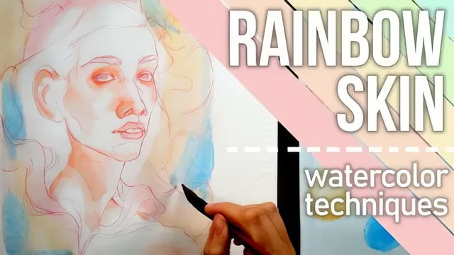
A 37-minute course that hands you a genuinely usable four-color skin-tone method, not just pretty inspiration shots.
Rainbow Skin is a tightly scoped class built around one central idea: skin in a watercolor portrait doesn't have to come from a single flesh-tone mix, it can be built from a small, disciplined set of primary colors layered and blended into each other. Arleesha Yetzer frames this as a four-color system, three primaries plus one accent that can't be mixed from the others, and the entire course is really an extended demonstration of what that limited palette can do.
Structure and technique
The course moves in a clear, logical arc: materials, a palette-mixing exercise, then a color-by-color breakdown of red, yellow, blue and purple, and green, before folding everything back together into two full class projects. The color-wheel exercise in the third lesson is the conceptual backbone of the whole class. It isolates the difference between saturated primary swatches and the muted, cross-contaminated mixes that actually belong on skin, and it explains, in concrete terms, why mixing a bit of all three primaries into every color keeps a portrait from clashing.
Each color lesson pairs a mixing instruction with a placement rule. Reds get warmed with yellow and go around the eyes, cheeks, ears, and neck. Yellows anchor the base skin tone and shift toward orange or get desaturated with a touch of blue. Purples and blues handle shadow and depth, with blue nudged toward green to keep it from reading as pure cool color. Green, treated as an optional substitute for purple in shadow areas, gets its own desaturation logic using red as its complement. The throughline connecting all of this, using a color's complement to knock back saturation without deadening it, is the most transferable skill in the class, and it shows up again and again by name in the mixing lessons.
The two class projects are where the method gets tested against real faces. The first is a loose sketchbook study on mixed media paper, useful mainly for showing how sketch lines and lifting color behave outside of cotton paper. The second, on cotton watercolor paper, is more deliberate, layering red, then blue, then yellow in overlapping passes so the colors blend into new tones on the page rather than being pre-mixed on the palette. Both examples reinforce the idea that colors should be revisited and layered multiple times rather than treated as a single application.
Strengths and limits
The class is honest about being a technique demonstration rather than a full portrait tutorial. Sketching, proportion, and rendering features like eyes and hair get only passing attention, and viewers without prior comfort in wet-on-wet blending or basic portrait layout will find the pace fast. There is no real troubleshooting section for muddy mixes beyond the complement principle, and viewers hoping for detailed brushwork instruction will come away wanting more.
What it delivers well is focus. At under 40 minutes it never pads itself with unnecessary material, and by the end a viewer has a specific, repeatable framework: pick four colors, understand their relationships, place them by zone, and layer with intention. For an intermediate watercolorist looking to break out of a single flesh-tone habit, that framework alone is worth the runtime.
The standout
The demonstration of desaturating a mix with its complement (adding a touch of blue to orange, or red to green) to keep four bold hues readable as skin rather than clashing.
What you will learn
- How to build and limit a four-color watercolor palette (three primaries plus one accent) for portrait skin tones
- How to mix each color family (red, yellow, blue/purple, green) so it stays harmonious rather than muddy
- Where to place each color on the face using general zone guidelines (blush areas, base tone, shadow recesses, cool undertones)
- How complementary colors desaturate a mix, and how to use that to control saturation on purpose
- A layering workflow for building depth with wet-on-wet and wet-on-dry glazing over multiple passes
- How to sequence a full portrait from sketch to finished layered painting across two worked examples
Best for: Watercolorists who already know basic wash and blending control and want a repeatable system for expressive, non-naturalistic skin tones.
Skip it if: Complete beginners to watercolor who haven't yet practiced wet-on-wet blending or basic portrait proportions.