
Radical Typography: Using Hand-Drawn Branding for Expression & More
James Victore · Author, Designer, Activist, Artist
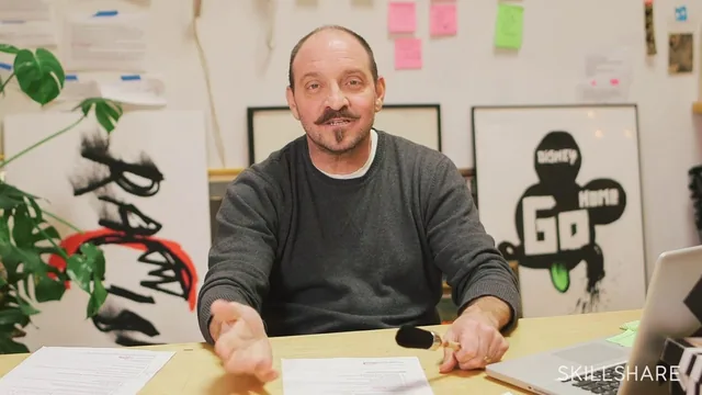
James Victore's 62-minute manifesto against clean, computer-perfect lettering hands you attitude and analog technique, not a step-by-step lettering tutorial.
James Victore's "Radical Typography" is less a typography course than a philosophy lecture with tools attached. Across twelve short lessons and just over an hour, Victore, a veteran poster designer known for Time and Smithsonian magazine covers, argues that clean, computer-generated lettering has drained the life out of design, and he spends most of the runtime making that case before ever picking up a pen on camera.
Structure and Argument
The first half of the class, covering branding, typography, and "finding your references," is almost entirely conceptual. Victore defines branding not as a logo but as a feeling, using Franz Kline and Keith Haring as examples of artists whose marks are instantly recognizable without ever repeating exactly. He then delivers his ten personal rules of typography, the closest thing the course has to a syllabus: learn the rules so you can break them, don't decorate garbage if your message is weak, avoid trends, and stop chasing what he calls "fake perfection." These rules are opinionated and entertaining, but they are attitude, not instruction. A student hoping for guidance on letter spacing, hierarchy, or composition will not find it here.
The Practical Sections
The back half earns its keep. Starting with "Surfaces," Victore walks through the physical materials he actually uses: ceramics, ordinary objects, even a model's skin and cosmetic pens for a one-shot Esquire assignment. The paint pen and Sumi brush lesson is the strongest in the course, showing him slice the rectangular tip off a Molotow paint marker to force a rougher, less controllable line, and explaining that clients often respond to the tiny accidental hairs and spatters a computer would clean away. The following lesson on duct tape and a chewed Ticonderoga pencil is equally concrete, tracing how a New York Times Magazine cover moved from rough pencil thumbnails to a finished illustration, and how a poster for a client called Helms Workshop was built entirely from strips of duct tape photocopied and enlarged. The handwriting and fingerpainting lesson closes with a genuinely useful reframe: your own handwriting, however messy, is a branding asset most people ignore because they were never taught to value it.
Where It Falls Short
The course never teaches type anatomy, layout, or how to actually execute a finished lettered word beyond "make a mark and don't clean it up." For a viewer who cannot already draw or compose a page, the exercises risk producing mess rather than expressive lettering. The final project, branding a personal theme as a vertical poster starting in black and white, is open-ended almost to the point of vagueness, with no rubric for what separates a successful result from a sloppy one.
What the course delivers instead is permission and a toolkit of unconventional materials, which is exactly what its title promises. Anyone already comfortable with a pencil or a brush, tired of polishing every letterform on a screen, will find real value in watching a working professional show his actual process, warts and all. Anyone starting from zero should look elsewhere first and come back to this for the attitude adjustment once the fundamentals are in hand.
The standout
Slicing and reshaping a stock paint pen tip before use, so the tool itself introduces uncontrolled, personal marks instead of a factory-perfect line.
What you will learn
- How to see branding as a feeling or gesture rather than a repeatable logo mark
- A working definition of typography built on Victore's ten personal rules (learn the rules to break them, avoid trends, kill fake perfection)
- How to alter off-the-shelf tools, like slicing the tip of a paint pen, to get an unpredictable hand-made line
- How to draw with unconventional materials: duct tape, a chewed number 2 pencil, cosmetic pens, whiteout, and bare fingers
- How to mine personal references (tombstones, old postcards, Toulouse-Lautrec, Ben Shahn) for a distinctive mark instead of copying existing fonts
- How to produce a final vertical poster that brands a chosen theme in radical hand-drawn type, starting in black and white before adding color
Best for: Working designers, illustrators, or letterers who already have basic craft skills and want permission and technique to loosen up their hand-lettering work.
Skip it if: Absolute beginners looking for a structured, step-by-step lettering or typography tutorial with technical fundamentals like kerning or type anatomy.