
Quick & Dirty Photocopy Effects in Adobe Photoshop
Evgeniya & Dominic Righini-Brand · Graphic Design & Photography
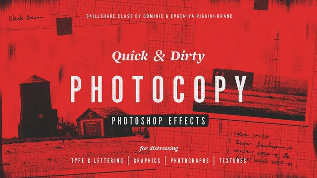
A tight 52-minute technique class that turns any graphic into a convincing photocopy toner texture using only stacked smart filters.
A single technique, thoroughly mined
This class does not try to cover much ground, and that is its strength. It teaches one core idea, a Smart Object stack combining the Torn Edges, Graphic Pen, and Grain filters, and then spends the rest of its 52 minutes showing every way that stack can be reused. The opening lessons set up a 3,000 by 2,000 pixel RGB document at 300 dpi and walk through converting a layer into a Smart Object, which matters more than it sounds like: because every effect lives inside a Smart Object as a smart filter, the underlying graphic can be swapped, and the filter settings can be reopened and tweaked at any time without rebuilding anything.
The middle section is where the class earns its runtime. It applies the same three filters to progressively harder source material: solid black type on white first, then multitonal illustrations, then full-color photographs. For photographs specifically, it offers two distinct results from the same filter set, a striped look built with Torn Edges contrast around 12 and Graphic Pen balance near 29, and a harsher, stippled contrasty look using grain intensity 60 and contrast 15. Seeing the same three sliders produce genuinely different textures depending on which values move is the clearest evidence that this is a flexible system rather than a one-off recipe.
Textures and assembly
Four texture-only lessons follow, each built from rendered Clouds, a Motion Blur pass, and the same filter gallery stack, varying only the grain type: contrasty for clumped toner, sprinkles for speckled texture, directional grain matched to the blur angle for stripes, and hand-drawn jagged selections along canvas edges for smudges. These textures are not decorative asides. The composite lesson immediately puts them to use, stacking two or three of them with Multiply blending mode to build layered, dirtier results, which reframes the earlier texture lessons as ingredient-building rather than separate exercises.
The coloring lesson is the most technically dense stretch, covering gradient maps for whole-image toning and then a more involved Blend If technique to color individual smart objects differently within one composite. It is useful information, but it moves fast, sliding the white toggle to around 250 and clipping a solid color fill layer to a group, without much room to absorb the logic before moving on.
The closing lesson on scaling is genuinely practical for anyone planning to print or resize this work: it explains why resizing a document with the filters still attached re-renders the grain at a new scale, while flattening first locks the detail level in before cropping. That distinction alone will save people from returning to redo work.
There is no true class project beyond experimenting and posting results, and the pace assumes familiarity with Smart Objects and blending modes from the outset. Anyone missing that foundation will need to pause often. For designers who already have it, this is a dense, well-organized technique class that delivers a genuinely reusable toolkit in well under an hour.
The standout
The reusable three-filter Smart Object stack (Torn Edges, Graphic Pen, Grain) that lets any graphic be distressed and re-edited non-destructively at any point.
What you will learn
- How to build a non-destructive Smart Object filter stack combining Torn Edges, Graphic Pen, and Grain to distress type and graphics
- How to adapt the same filter stack for photographs and multitonal illustrations using two distinct looks (striped and contrasty)
- How to generate four standalone toner textures (clumped, sprinkled, striped, smudged) from rendered clouds and motion blur
- How to composite multiple distressed layers and textures together using the Multiply blending mode
- How to add color via gradient maps or per-layer Blend If settings without losing the distressed look
- How to scale finished composites up or down while keeping grain proportional using image size versus flatten-and-crop
Best for: Graphic designers, letterers, illustrators, and photographers who already know their way around Photoshop layers and smart objects and want a fast, repeatable distressing workflow.
Skip it if: Photoshop beginners unfamiliar with smart objects, layer blending modes, and filter galleries, since the class moves through setup steps quickly without re-explaining fundamentals.