
Practical Graphic Design: Learn Adobe InDesign Through Fundamental Design Principles
Kyle Aaron Parson · Graphic Designer and Illustrator
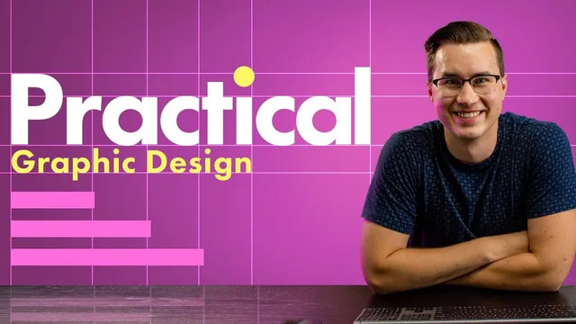
A 94-minute crash course in InDesign layout basics that trades software depth for three design principles you'll actually remember.
What it actually covers
This course sets out to do two things at once: teach the bare mechanics of Adobe InDesign and teach three foundational design principles, alignment, hierarchy, and typography, using InDesign as the vehicle. It mostly succeeds at the second goal and only partially at the first.
The opening lessons handle the unglamorous but necessary groundwork: trim, margins, and bleed, why printers need oversized paper and a 0.125-inch bleed allowance, and the difference between RGB for screens and CMYK for print. From there it moves into the InDesign welcome screen, document setup, and a quick tour of the toolbar, covering selection tools, shape and frame tools, and the type tool. None of this goes deep. It is oriented entirely around getting a beginner to a blank, correctly configured document, not around teaching the software as a system.
The middle section is where the course earns its keep. Before touching alignment digitally, it introduces knolling, the practice of arranging physical objects (a keyboard, pens, a notebook) at right angles around a key reference object. It is a small, almost tactile exercise, but it reframes alignment as something you can feel before you apply it in software. From there the alignment lesson walks through a genuinely useful practice file, a cluttered pizza history layout, and shows how the Align panel's "align to margin," "align to page," and "align to selection" options solve real placement problems, plus how the smart guides highlight relationships between objects as you drag them.
Hierarchy, typography, and the project
The hierarchy and typography lessons follow the same pattern: a short explanation followed by a practice file. Typography in particular gives concrete, usable rules, limit a design to two font families, pair a decorative display font with a plain serif or sans serif for body text, and use kerning, tracking, and leading as fine-tuning tools rather than default settings to ignore. Naming Arial, Georgia, and Minion Pro as reliable body fonts is a small but practical touch that a beginner can act on immediately.
The class project, building a "how to order pizza" flyer from provided assets, is the strongest part of the course. It walks through cutting placed text into separate frames, grouping title elements, distributing spacing evenly with the Align panel, applying color to text fill rather than frame fill, adding image frames, and exporting to PDF or JPEG with correct bleed settings for print versus screen. Watching a full document get built from a blank page to a polished flyer, including a wrong turn or two get corrected in real time, does more to cement the alignment and hierarchy lessons than the standalone practice files do on their own.
Where it falls short
The course is honest about its own limits, but those limits matter. At 94 minutes total, InDesign's more powerful features, paragraph and character styles, master pages, multi-page and book workflows, tables, are absent entirely. A student who finishes this course can build a single polished flyer but has not been taught how to work efficiently across a multi-page document, which is arguably where InDesign earns its reputation over Illustrator or Photoshop for layout work.
The pacing also assumes comfort with adjacent Adobe tools. Concepts like frames versus content, the content grabber, and keyboard modifiers for scaling are explained, but quickly, and a true beginner to design software generally may need to pause and rewatch. For someone who already knows their way around Illustrator or Photoshop and just needs InDesign's layout logic and a refresher on alignment and hierarchy, the pace is fine, even efficient.
The standout
The knolling exercise, arranging everyday objects at right angles before ever opening InDesign, gives a hands-on, low-stakes way to internalize alignment before applying it digitally.
What you will learn
- Setting up a print document in InDesign with trim, margins, and bleed correctly configured
- Distinguishing RGB versus CMYK color modes and when to use each
- Using knolling to arrange objects at right angles before building a layout
- Applying alignment tools and the Align panel to create visual relationships between elements
- Building hierarchy through scale, weight, and color contrast to guide a viewer's eye
- Pairing display and body fonts and adjusting kerning, tracking, and leading
Best for: Someone who already owns InDesign and knows Photoshop or Illustrator but has never touched layout software and wants a fast, principle-first orientation.
Skip it if: Anyone with no design software experience at all, or anyone hoping for deep coverage of InDesign's advanced features like master pages, styles, or long-document workflows.