
Poster Design: Textures and Halftones for Screen Printing
DKNG Studios · Design + Illustration
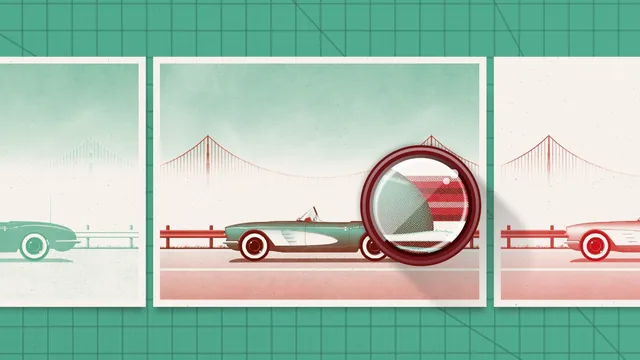
A working screen printer and two design leads walk through the exact Photoshop and Illustrator moves that turn flat vector art into print-ready separated files.
This course picks up exactly where a poster designer gets stuck: the artwork looks finished on screen, but a screen printer cannot burn a screen from a gradient-filled Illustrator file. Taught by the team at DKNG Studios with an on-camera segment from professional printer Danny Askar, the class walks through the full conversion pipeline, from adding realistic texture to a vector illustration through to producing halftoned, trapped separations ready for the print shop.
From flat vectors to printable texture
The opening lessons cover something most poster tutorials skip: building your own texture library from photographs of everyday surfaces, in this case a stretch of cement and a patch of sky shot near the instructor's home. The process is deliberately hands-on, using Photoshop's Clone Stamp to erase distracting details like leaves and manhole covers, then pushing the Levels sliders until the image reads as pure grain rather than a recognizable photo. The trick worth remembering is how a grayscale texture becomes a colored overlay: convert it to Bitmap mode, isolate the black or white pixels, delete the rest, and recolor what remains with a Color Overlay effect so it can sit on top of any base color as a multiply layer. Linking these Photoshop files into Illustrator rather than embedding them means edits in Photoshop propagate automatically, a workflow habit that pays off repeatedly later in the course.
Two roads to separations, then trapping
The separations section is the structural core of the class, and it teaches the same result two different ways. The Pathfinder method uses boolean operations to isolate each ink color as a single compound shape, while the manual method walks through selecting same-fill-color objects layer by layer and manually reassigning them to white or to the target ink. Showing both approaches is useful because they suit different kinds of artwork: dense overlapping shapes benefit from Pathfinder's speed, while illustrations built from many individual objects are often easier to reason about by hand. Trapping gets the same double treatment, with the manual pass being the more instructive of the two: adding a colored stroke, converting it to a filled shape, and then using Pathfinder's Divide function against the paper-color shape to strip away trapping in areas where it would create an unwanted halo rather than hide a registration gap.
Halftones and the print test
The halftone lessons are shorter but dense with print-specific knowledge, covering how Bitmap mode's Halftone Screen setting trades dot frequency for detail, why round, line, and diamond dot shapes change the visual texture of a fill, and why each additional ink color needs its halftone angle rotated 30 degrees from the last to avoid a moire pattern. The course closes by reassembling the separated, halftoned TIFFs back into Illustrator with their real ink colors and multiply blending, a practical check that catches problems before a physical screen gets burned.
Where the course is thinnest is pacing for newcomers. Pathfinder operations, layer locking, and Bitmap conversions are demonstrated at working speed with the assumption that viewers already know their way around both applications, so anyone new to Illustrator's compound shapes will need to pause frequently. It is also tied closely to one specific illustration style, gradients and soft-edged posters, so viewers preparing flat-color or type-heavy designs will need to adapt several steps rather than follow along literally. For designers who already have a poster ready and just need the bridge to a print shop, though, this is a genuinely thorough and specific technical education.
The standout
The manual trapping demonstration, where a stroke is added, expanded with Pathfinder Divide, and then cut back against the paper-color shape so the trap only appears where colors actually overlap.
What you will learn
- Building custom grayscale textures from your own photos and layering them into vector art with multiply and blend techniques
- Converting a full-color illustration into individual color separations using both the Pathfinder tool method and a manual color-by-color method
- Adding trapping to prevent white gaps or color halos when print registration is imperfect
- Setting up halftone screens in Photoshop's Bitmap mode, including frequency, angle, and dot shape choices
- Avoiding moire patterns by rotating each color's halftone angle in 30-degree increments
- Testing separated and halftoned files by reassembling them in Illustrator before sending to print
Best for: Illustrators and poster designers who already work fluently in Illustrator and Photoshop and want to prepare their own artwork for screen printing.
Skip it if: Beginners who have not used Pathfinder operations, layer blend modes, or Photoshop's Bitmap conversion before, since the course assumes that fluency and moves fast.