
Make Great YouTube Thumbnails
Evan (PolyMatter)
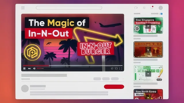
A YouTuber with over a million subscribers breaks down thumbnail design in 71 minutes, but the software he teaches costs money and skips much of the theory.
"Make Great YouTube Thumbnails" is exactly what it says on the label: a compact, 71 minute walkthrough of how a working YouTuber actually approaches the single image that determines whether anyone watches a video. Evan, who runs the channel PolyMatter, structures the course as a funnel. It opens with why thumbnails matter more than titles or tags, moves into what separates a good one from a bad one using real examples from other educational channels, then narrows into the mechanics of building one in Affinity Designer, and closes with a catalog of common mistakes and a section on testing.
What the course actually teaches
The strongest stretch is the analysis section, where several thumbnail styles get compared side by side: one channel's color-coded consistency, another's poster-like art direction, a third's deliberately minimal white-background-plus-face approach. Rather than prescribing a formula, the course extracts a short list of principles: striking visuals, consistency, relevance to the topic, and scalability down to a tiny mobile size. That list becomes the throughline for the rest of the course, referenced again during the full build and again during the mistakes lesson.
The design instruction itself covers real ground for a beginner: creating and combining shapes, layering and locking objects, converting text to editable curves, building custom paths with the node tool, applying masks and gradients, and adding texture overlays for effects like a paper grain. A full example thumbnail, recreated from a past North Korea economy video, gets rebuilt from a blank canvas using a grid element, a downloaded world map, a flag, drop shadows, and rounded rectangles for the title card. Watching that build reveals genuinely useful shortcuts, like using command-return to convert text into editable shapes or excluding busy layers from snapping.
Where it comes up short
The course leans on Affinity Designer for every demonstration, and while it is framed as a low-cost alternative to Adobe's subscription tools, anyone without it or an equivalent vector editor will need to adapt every instruction on the fly, since menu names and tool locations will not match. The pacing is also uneven: the interface tour and advanced techniques video cram in a lot of tool-by-tool detail in quick succession, which risks losing viewers who are not pausing to follow along in their own file, something the course itself repeatedly recommends doing.
The mistakes lesson is the clear highlight and worth the price of admission on its own, since it takes real thumbnails and shows a flawed version next to a fixed one for problems like undersized text, an overloaded background, and low contrast between text and its backdrop. The closing lesson on testing is thinner by comparison, mostly amounting to a suggestion to ask friends for feedback or run manual A/B swaps using YouTube's own analytics, with no deeper framework for how to interpret the data.
Overall this is a well-organized, honestly framed introduction that avoids overselling itself, the instructor is upfront that it cannot cover everything Affinity Designer offers and repeatedly points learners toward further practice and other resources. It succeeds at building design judgment rather than handing over a copyable template, which is both its main strength and the reason it demands active participation to get real value out of it.
The standout
The mistakes lesson, which recreates six of the instructor's own thumbnails with a single flaw changed and shows them side by side against the originals.
What you will learn
- How to identify the four core traits of an effective thumbnail: striking visuals, consistency, relevance, and scalability
- How to brainstorm and narrow down thumbnail concepts before opening any design software
- Basic vector shape, layer, mask, gradient, and text tools inside Affinity Designer
- How to build a complete thumbnail from a blank canvas through a full walkthrough example
- The six most common thumbnail mistakes, including tiny text, low contrast, and clutter
- How to gather feedback and use analytics to test which thumbnails perform best
Best for: A beginner creator with no design background who wants a practical, opinionated starting point for thumbnail-making and is willing to learn Affinity Designer.
Skip it if: Anyone already comfortable in Photoshop or Illustrator, or anyone hoping for a fixed template or formula rather than general design judgment.