
Logotype Design: Create Brand Marks with Typography
Mackey Saturday · Graphic Designer
A working identity designer builds one script logotype from scratch on camera, teaching the process rather than a checklist of design rules.
Mackey Saturday's logotype class does one thing and does it in real time: it builds a single script wordmark, "The Lookout," for a friend's skate shop, from first pencil marks to a finished vector mark applied to a sticker mockup. There is no separate theory module and no slide deck of design principles recited in the abstract. Every idea gets introduced at the exact moment it is needed, which makes the course feel more like sitting next to a working designer than watching a lecture.
Structure and process
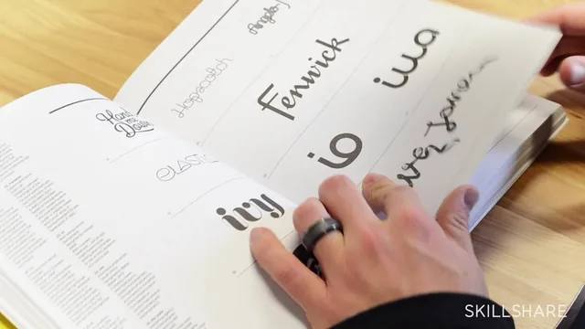
The arc runs through five real stages: research, hand sketching, digital refinement, fine-tuning, and application. The research section is more substantial than the term usually implies here. Rather than just telling students to look at competitor logos, Saturday explains a deliberate move of pulling reference from industries adjacent to but not inside the client's world, in this case blending sports-jersey lettering with sign-painting and Japanese corporate identity books to land on a script that feels native to skateboarding without repeating what every other skate shop has already done. That reasoning, shown through physical books on camera, is more useful than most "get inspired" advice because it explains why certain sources were chosen over others.
The sketching stage is unusually candid about how messy real process looks. Saturday writes the word over and over by hand, admits the results are ugly, and explains that the repetition is what surfaces natural relationships between letters, like an L and T that can extend to create symmetry with the letters between them. This section will frustrate anyone hoping for a shortcut, but it accurately represents how experienced letterers actually work.
The technical core
The digital refinement lessons are where the course earns its intermediate label. Saturday sets up guides for baseline, x-height, and cap height, then redraws each letter in Illustrator with the pen tool, deliberately using as few anchor points as possible and placing them at the extremes of each curve. He explains directly why Image Trace is the wrong tool for this work: it fails to place anchor points where a designer needs control to adjust curves later, and it breaks the continuous stroke logic that comes from drawing letters as overlapping shapes rather than closed outlines. That single explanation is worth more than most generic "here's the pen tool" tutorials.
The fine-tuning lesson introduces a genuinely reusable kerning system, assigning proportional spacing values to straight-to-straight, straight-to-curve, and curve-to-curve letter pairs, plus a trick of flipping the whole logotype upside down to judge letter relationships purely as shapes rather than as readable words. These two techniques alone justify the runtime for anyone doing custom lettering work.
Where it falls short
The course assumes comfort with Illustrator already; there is no explanation of basic tools, and someone unfamiliar with anchor points, layers, or the pathfinder panel will get lost during the refinement lessons. It also covers only script wordmarks built around one project, so students wanting guidance on sans-serif construction, symbol integration, or multi-word lockups will need to look elsewhere. The pacing in the middle lessons runs long, with extended real-time tool manipulation that could have been tightened without losing the instructional value. Still, for what it promises, a real logotype built start to finish with explained reasoning at each step, it delivers.
The standout
The kerning-by-ratio system, where straight-to-straight, straight-to-curve, and curve-to-curve pairs get fixed proportional spacing (1x, two-thirds, 1.5x), turns a usually intuition-based step into a repeatable method.
What you will learn
- How to research a client's industry by pulling reference from adjacent, non-obvious fields rather than direct competitors
- How to sketch a wordmark by writing the name over and over by hand to find natural letter relationships before touching a computer
- How to redraw hand sketches in Illustrator using the pen tool with minimal anchor points placed at curve extremes, each letter as its own overlapping shape
- A concrete kerning system based on space ratios (full space for straight-to-straight, two-thirds for straight-to-curve, 1.5x for curve-to-curve)
- A mirroring trick (flipping the logotype upside down) to judge letterform balance and negative space without reading the word as language
- How to apply a finished logotype to mockups like stickers or apparel to pitch it to a client
Best for: Designers who already know their way around Illustrator's pen tool and want to see a professional's actual sketch-to-vector workflow for a single wordmark project.
Skip it if: Total beginners with no vector software experience, or anyone wanting broad logo design theory covering symbols, color, or brand systems beyond letterforms.