
Logo Design Workflow: Creating Timeless and Modern Logos
Robert Matyas
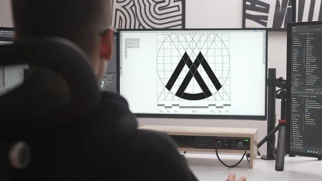
A practicing brand designer walks through his real logo workflow from brief to Illustrator file, warts and all.
Robert Matyas structures this course as two halves: a theory pass through what makes a logo work, then a full client project executed start to finish. The theory section leans on a simple/distinctive/appropriate framework, illustrated with case studies like Apple's byte reference, BMW's propeller-derived crossing pattern, and FedEx's negative-space arrow. He also revisits his own decade-old work (an "Info Secure" logo and a "Wine Click" mark) and dissects why they failed, showing a messaging-bubble icon that muddled the concept and a serif slab-font detail that created inconsistency between letterforms. That willingness to show bad personal work alongside famous examples is more useful than most "good vs bad logo" slides, because it demonstrates the reasoning process rather than just the verdict.
The practical workflow
The back half follows a fictional client, a marketing agency called Jamero, through a brief questionnaire, target-audience notes, competitor research, and mood-boarding in Pinterest and Photoshop. The research section runs long and repetitive, essentially narrating scrolling through stock-logo sites while flagging generic trends to avoid, but it does model a real habit: pacing research in short blocks to avoid burnout and staying alert to overused stock-logo tropes like three ascending bars representing growth.
The sketching and digital design lessons are the strongest material. Matyas sketches quickly and without polish, echoing Aaron Draplin's high-volume, low-fidelity approach, then moves into Illustrator to build a letterform-based growth mark. He demonstrates duplicating and adjusting versions rather than using Undo, so multiple weight and proportion variants remain comparable side by side, and he uses the Pathfinder's divide function combined with the Shape Builder tool to cut overlapping strokes into clean, non-crossing negative space. Testing the mark against both white and black backgrounds to judge visual weight is a small but genuinely practical habit many logo tutorials skip.
Presentation and delivery
The course closes with the client-facing side: assembling a three-concept presentation deck (symbol alone, wordmark alone, combined lockups), showing the mark on business cards and signage mockups, and preparing a deliverables package with RGB, CMYK, and Pantone codes plus font licensing notes. This is unglamorous but valuable information that many logo courses skip entirely, and it correctly frames presentation and negotiation as the skills that actually get logos approved.
Where the course falls short is polish and pacing. Matyas talks through his process in a stream-of-consciousness style, with long unedited stretches of browsing reference sites and occasional tangents into typography apps and font-matching tools that add length without much new information. The typography section is thin for something billed as covering "typography basics," mostly consisting of font recommendations and a kerning-practice app demo rather than real instruction in spacing, hierarchy, or pairing. Viewers wanting a rigorous grounding in type or brand strategy will find the coverage shallow.
Still, for someone who already has basic Illustrator fluency and wants to see an actual designer's file, from client questionnaire to finished lockup, hold together as one workflow, the course delivers exactly that. It is less a polished lecture than a screen-recorded walkthrough of a working process, imperfections included, and that transparency is its main value.
The standout
The live Illustrator segment where he builds a wordmark's negative-space growth symbol with the Pathfinder divide tool and Shape Builder, keeping every iteration as a separate copy instead of undoing, so the full decision trail stays visible for comparison.
What you will learn
- Apply the simple/distinctive/appropriate framework to critique and refine a logo concept
- Run a client brief and target-audience questionnaire before starting design work
- Build a moodboard from Pinterest, Dribbble, and Photoshop composites to define visual direction
- Construct wordmarks and symbols in Illustrator using the Pathfinder, Shape Builder, and pen tool, including negative-space tricks
- Test a mark at 16x16px and on black vs. white backgrounds for functional robustness
- Package a three-concept client presentation deck and a final deliverables set with color codes and file formats
Best for: A self-taught or early-career designer who already knows basic Illustrator and wants a repeatable, client-facing logo process rather than more design theory.
Skip it if: Anyone wanting deep typography instruction, brand strategy rigor, or a polished, tightly-edited teaching style, since delivery is conversational and occasionally repetitive.