
Logo Design with Grids: Timeless Style from Simple Shapes
George Bokhua · Digital Graphic Designer & Illustrator
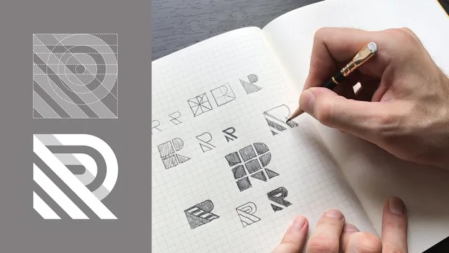
A 31-minute lesson in one narrow technique, grid-based logo construction, taught by a working designer with a decade of client marks behind him.
A narrow, well-demonstrated technique
George Bokhua's class is not a logo design course in the broad sense. It does not cover naming, brand strategy, client presentation, or even color theory beyond a passing note on inversion. It teaches one specific skill: how to use a grid to catch and fix geometric inconsistency in a mark built from simple shapes. Within that narrow scope, it is thorough and confident.
The opening stretch functions as a visual reference library rather than a tutorial. Bokhua walks through dot grids, square grids with 45-degree diagonals, and 30-degree hexagonal grids, pointing to Frank Stella paintings and Otl Aicher's 1972 Munich Olympics pictograms as proof that grid-based construction produces both order and, when needed, a sense of dimensional depth. This section rewards viewers who like seeing a principle demonstrated across unrelated fields before being asked to apply it themselves. It also runs long relative to how little of it is directly actionable, since none of these reference examples get built alongside the viewer.
The project itself is a single letterform, the letter R, which Bokhua chooses based on Gotham's geometric construction of triangle, circle, and two squares. His sketching process is the most honest part of the class: he describes filling five or six pages with 40 to 50 rough variations, warns against expecting a good result in the first handful of tries, and recommends blocking off two to three uninterrupted hours to stay in a creative flow state. That is realistic, useful advice for anyone who freezes up waiting for the "right" idea to appear fully formed.
From paper to Illustrator
The gridding-on-paper lesson is where the class's central technique becomes concrete. Bokhua divides his sketch into a three-unit grid with diagonal dividers, explaining a specific and slightly counterintuitive rule: white space needs to be drawn thinner than black space to read as visually equal, since black shapes carry more optical weight. This kind of calibrated detail is the sort of thing that separates a working professional's notes from a generic tutorial.
The Illustrator section rebuilds that same grid digitally, using guides, the pen tool, and repeated toggling into wireframe mode to check that every curve and diagonal lands exactly where the paper sketch intended. It is a legitimate technique for catching the kind of subtle angle drift that is invisible until it is pointed out, and Bokhua does point out a real one, an inconsistency in his own reference example that only the grid overlay reveals.
Where the class falls short is pacing and accessibility. The Illustrator walkthrough moves quickly through tool references, snapping, copying, and cutting shapes, with little pause to explain menu locations or shortcuts for anyone unfamiliar with the software. Skillshare's own framing claims the exercise lives 80 percent on paper, but the computer portion still assumes real prior fluency with Illustrator's pen tool and guide system. A first-time user will likely need to pause and look up basic mechanics that a true beginner class would slow down to cover.
At 31 minutes, this is a tight, single-technique lesson rather than a comprehensive course. It delivers real professional insight, particularly the paper-to-Illustrator grid-transfer process and the black-versus-white space weighting note, but it is best treated as a focused add-on to existing sketching and Illustrator skills, not a first introduction to logo design.
The standout
The wireframe-mode check in Illustrator, where the designer rebuilds his paper grid as live guides and toggles wireframe view to catch angle mismatches invisible in a flat sketch.
What you will learn
- How to distinguish grid types (dot, square, 30-degree/hexagonal) and pick one to fit a mark's geometry
- How to sketch a letterform through 40-50 rough iterations before committing to a direction
- How to overlay a compass-and-ruler grid on a paper sketch to catch angle and spacing inconsistencies
- How to rebuild a paper grid in Illustrator using guides, the pen tool, and wireframe mode to verify alignment
- How to define an exclusion zone around a finished mark
- How to add a subtle drop shadow between grid segments for a folded, dimensional look
Best for: Designers and illustrators who already sketch logos by hand and want a repeatable method for tightening geometric precision.
Skip it if: Complete beginners to logo design or Illustrator, since the class assumes fluency with both pencil concepting and vector pen-tool work.