
Logo Design: New Ways to Create Custom Vintage Type
Simon Walker · Graphic Designer
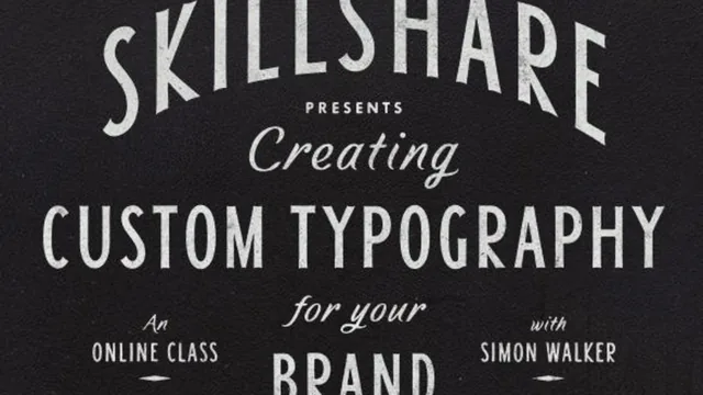
An 81-minute walkthrough of one designer's exact Illustrator and Photoshop process for building a vintage-style vector logo from scratch, sketch to weathered texture.
This class is a screen-recorded walkthrough of one project, start to finish: a vintage eyewear logo called Quinn's, built by designer Simon Walker from a scrawled napkin sketch to a textured, weathered final file. There is no theory module and no slide deck. Walker sketches, vectors, letters, layouts, then textures, narrating his own choices as he makes them, warts and all.
What the process actually covers
The opening move is a good one: choose a business name that gives you letters worth playing with. Walker picks the letter Q because a doodle of it looked like a monocle, then builds "Quinn's Vintage Eyewear" around that accident. He is candid that his own sketching is deliberately rough, scrawled on the back of a paid bill, and that the real design work happens on the computer, not on paper. That is useful context-setting for anyone who assumes professional logo work starts with a polished notebook sketch.
The vectoring section is where the class earns its keep. Walker demonstrates in Illustrator's Keyline view how commercial typefaces get built with a minimal, disciplined set of anchor points placed at the north, south, east and west extremes of a curve, and shows a specific Align-tool trick for snapping two points level without selecting the whole shape. He builds from a single-stroke skeleton outward into thick-and-thin strokes, following a rule of thumb that the fat part of a stroke sits on the left and right of a letter, the thin part on the top and bottom.
The letter S gets its own lesson, and it is the strongest ten minutes in the class. Walker claims he can draw a usable S in six vector points and proves it live, badly at first, then refined into shape with a note that the top bowl should read slightly smaller and narrower than the bottom one. It is a genuinely transferable rule that most letterform tutorials skip past.
The layout section is looser and more instructive by omission than instruction: Walker tries several arrangements on camera, several of which visibly fail, before landing on a three-typeface stack that reads as cohesive. Watching a professional discard work is arguably more honest than a tutorial that only shows the finished choice.
Where it thins out
Texturing closes the class in two stages: a vector method (Roughen effect applied to a unified compound path, then manually recleaned point by point) and a raster method (lifting grain from scanned paper and leather textures in Photoshop, including a reverse-out trick using Image > Adjust > Invert). Both are shown clearly enough to follow, though the second pass through the raster section repeats material from the first almost verbatim, padding out an already short runtime.
The class assumes real fluency already. Terms like Pathfinder, compound path, and Keyline arrive with no definition, and anyone who has not spent time in Illustrator's vector tools will lose the thread inside the first ten minutes. There is also no finished-file download walkthrough or exercise file structure to practice against, just narration over Walker's own screen. The addendum adds three genuinely useful supplementary tips, working in single stroke widths, filling in missing characters from old book type, and recreating existing fonts to learn their construction, but they arrive as a rushed afterthought rather than integrated lessons.
At 81 minutes, this is closer to watching over a working designer's shoulder than a structured course, and it delivers real, specific technique for viewers who already have the software chops to keep pace.
The standout
The letter S breakdown, where the six-vector-point construction method and the rule about the bottom bowl being wider than the top turns the hardest letter in the word into a repeatable formula.
What you will learn
- How to loosen up the sketching phase and let a name or letterform emerge from doodles rather than a brief
- How to vector rough sketches in Illustrator's Keyline mode while keeping vector points to a minimum, matching how real typefaces are constructed
- How to draw a serif-italic letterform with consistent thick and thin strokes, including a six-point method for the letter S
- How to stack and layer supplementary type (dates, taglines, trademarks) to balance a busy lockup
- How to age a vector logo using the Roughen effect on a compound path, then hand-clean the resulting anchor points
- How to build raster grain in Photoshop from scanned paper textures, including a command-click selection trick and an inverted leather-texture treatment
Best for: Intermediate designers who already know Illustrator's pen tool and want to see a working professional's actual habits, shortcuts, and decision points on a single project.
Skip it if: Beginners who have never used the pen tool or Pathfinder panel, since the class assumes that fluency and never stops to explain the basics.