
Logo Design Mastery: The Full Course
Lindsay Marsh · Over 500,000 Design Students & Counting!
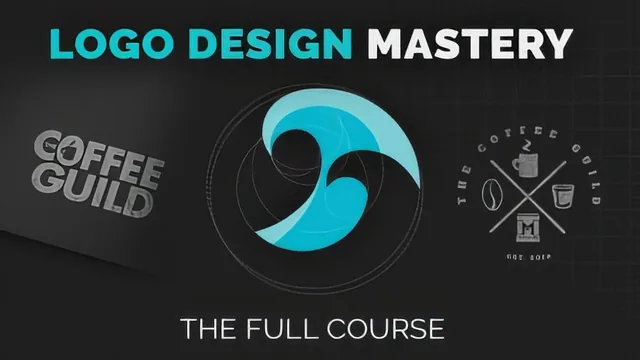
A working designer's full logo pipeline, from theory through Illustrator execution to client hunting, worth it if you commit to the whole run.
A full pipeline, not a highlight reel
This course sets out to cover the entire arc of logo design, from theory to Illustrator mechanics to client acquisition, and it largely delivers on that scope. The opening theory block is the strongest section: it defines logotype versus logomark with real examples (Apple's mark working without text, IBM as a monogram, FedEx as a wordmark), then moves into spacing and kerning with a specific demonstration of why a "T" and "P" pair differently than a "T" and "A" pair optically. This is the kind of granular, correctable detail that separates a course written by a working designer from one written by a marketer, and it sets a credible tone for everything that follows.
The styles lesson that follows is essentially a structured taxonomy: flat, illustrative/hand-drawn, grunge, geometric, gradient, crest, polygon, golden ratio, negative space, and double-meaning logos, each explained with a defining visual trait rather than just a label. It functions well as a reference a designer could return to when stuck on concept direction, and the accompanying cheat sheet resource extends its use past the video itself.
Where the course spends its time
The Illustrator tools section is a genuine crash course rather than padding, covering width tool, offset path, shape builder, layering masks, and gradients as tools that get reused constantly in the later projects, so the sequencing makes sense even if a fluent Illustrator user will want to skip ahead.
The bulk of the runtime sits in two full client projects, a coffeehouse seal logo and a Pacific-themed wordmark built around the golden ratio. These sections are valuable precisely because they are unhurried: viewers see rejected sketches, a shift in alignment because a mark felt "left heavy," and multiple rounds of typeface elimination narrated with the actual reasoning ("not enough contrast," "reads too aggressive at tight tracking"). That transparency about a messy, iterative process is rare in design courses that usually only show the finished output, and it is the course's biggest asset for anyone trying to internalize how professional judgment actually works rather than just copying a result.
The final stretch pivots away from craft into business: portfolio structure (three case studies, not more), presentation formatting for client review (one concept per page, generous white space), and a five-stage client-finding funnel ending in referrals. This section is honest about the slow grind of freelance client acquisition and avoids overselling platforms like contest sites, explicitly warning that spec work should stay limited to nonprofit practice rather than a business model.
The tradeoffs
The pacing is deliberately slow, aimed at beginners who need every step narrated, which means intermediate viewers will do a fair amount of skipping. The course also leans heavily on narrated screen recording rather than tight editing, so absorbing the typography and golden ratio sections takes patience. None of this undermines the content, but it does mean the stated 339 minutes rewards someone genuinely working through it in sequence rather than someone hoping to extract a quick technique. For a learner willing to put in that time, the combination of theory, tool mechanics, real client process, and business grounding is unusually complete for a single course.
The standout
The two full client projects, a coffeehouse seal logo and a Pacific-themed wordmark, walked start to finish including rejected concepts and typography narrowing, showing the actual decision-making a working designer does rather than a polished result with the process hidden.
What you will learn
- How to read and construct logo anatomy: logotype, logomark, spacing, optical adjustment, and kerning fixes
- How to categorize and apply logo styles such as flat, grunge, geometric, gradient, crest, polygon, and negative space
- How to use specific Illustrator tools (width, offset path, shape builder, layering masks, gradients) inside a real build
- How to run a client-facing process from questionnaire through sketching, concept refinement, and typography pairing
- How to construct a golden ratio grid and apply it to shape and spacing decisions in a logo
- How to package a portfolio, present concepts professionally, and pursue clients through referrals and local networking
Best for: Beginner to intermediate designers who already know basic Illustrator navigation and want a structured path from theory to a sellable logo process.
Skip it if: Complete beginners to Illustrator or anyone wanting a fast style-only reference, since the pacing is deliberately slow and heavily narrated.