
Logo Design: How to Create a Unique & Memorable Wordmark
Khadija El Sharawy · Graphic Designer & Storyteller
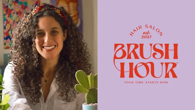
A fast, hands-on walkthrough of building one wordmark from brief to finished logo, best suited to Illustrator users who already know the basics.
A single wordmark, built in full view
This class picks one narrow slice of branding, the wordmark, and walks through it start to finish using a single fictional case study: a hair salon called Brush Hour. That narrowness is the class's biggest strength. Rather than a broad survey of logo theory, it shows one designer's actual sequence of decisions on one project, from a two-paragraph creative brief through keyword extraction, a moodboard, font hunting, hand manipulation in Illustrator, color, and a final descriptor line wrapped around the mark. Anyone who has stared at a blank Illustrator canvas wondering where a wordmark actually comes from will recognize the value of watching that gap get filled in real time.
The font-sourcing lesson is the most immediately reusable part, and it is refreshingly specific: five named sites, each with a short explanation of what it's good for and why. The moodboard lesson doubles down on that specificity, breaking references into human photography, mood photography, and typography, and explaining why an image of a megaphone or a pair of gloves earns a place next to a font sample even though neither has anything literally to do with a hair salon.
Where the craft actually happens
The strongest teaching moment is the font manipulation stretch, where a screenshotted reference font gets image-traced in Illustrator, stripped of its color, and then rebuilt by hand: connecting letterforms with the Pen tool, deleting and smoothing anchor points, and using the Width tool to push and pull stroke thickness until the whole word reads as one custom shape rather than a stock typeface with a name typed into it. This is a genuinely transferable skill, and it is shown with enough specific tool references (Image Trace's Advanced panel, the Width tool shortcut, the Smooth tool) that a viewer with basic Illustrator fluency could follow along on their own project immediately.
The color and final-touches sections are shorter but land a similar lesson: picking a palette straight from the moodboard rather than starting fresh, and articulating why a burnt orange against a desaturated lilac reads as both bold and feminine. The closing ten-tip recap is a serviceable checklist, though it repeats ground already covered rather than adding anything new.
The class is honest about its own limits. It states upfront that it assumes Illustrator competence and some branding background, and that promise holds. A total beginner will lose the thread the moment anchor points, the Pen tool, and Image Trace settings start flying past without any setup explanation. The moodboard segment also moves quickly through a step the narrator admits deserves its own class, so it functions more as a demonstration than a tutorial on moodboarding itself. At under fifty minutes covering a full project, depth is necessarily traded for pace. What is here, though, is a coherent, well-narrated single case study rather than disconnected tips, and that makes it worth the short time it asks for.
The standout
The image-trace-then-rebuild technique, screenshotting a reference font and using it only as a rough skeleton to hand-modify in Illustrator, is a concrete, repeatable way to design an original wordmark without starting from a blank page or copying a typeface outright.
What you will learn
- How to turn a creative brief into a short list of keywords that drive every design decision
- How to build a nine-square moodboard split between typography and photography references
- How to source display and script fonts from specific type sites (Typeverything, YouWorkForThem, VJ Type, Behance, Brandsemut)
- How to image-trace a screenshotted font in Illustrator and rebuild it by hand into an original wordmark
- How to use the Width Tool to vary stroke thickness across letters for a custom, non-generic feel
- How to pick a two-color palette pulled directly from the moodboard and justify it psychologically
Best for: Illustrator users with some branding background who want to see a real wordmark built start to finish and pick up a repeatable process.
Skip it if: Complete beginners to Illustrator's pen, width, and image-trace tools, who will struggle to follow the manipulation steps without pausing to look up the basics elsewhere.