
Logo Design Basics: Develop a Memorable Brand Identity
Shantanu Kumar · Designer & YouTuber
A 27-minute walkthrough of one designer's real client process, useful for the workflow but too short to teach actual logo craft.
Shantanu Kumar's course promises a demystified logo process and mostly delivers on that narrow promise: it shows the shape of a professional workflow, not the craft skills inside it. Across seven short lessons and one worked example, a fictional co-working cafe called Keqis Creative Club, it moves from client brief to finished combination mark in under half an hour.
The strongest stretch is the middle third. The research and moodboarding lessons are more procedural than most logo courses bother to be. Kumar walks through drafting four brief questions (why do you exist, what is your purpose, what future do you want to create, what principles guide your behavior), building user personas, and doing competitor research by physically visiting co-working spaces and coffee shops. He then shows a concrete mind-mapping exercise: writing the client name in the center of a page, branching out to adjectives, and using five to ten of those words as search terms on Pinterest, Dribbble, and Behance. The explicit rule to avoid pulling competitor logos into a mood board, so as not to bias the design too early, is a small but genuinely useful piece of professional discipline.
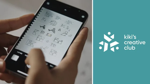
The sketching and polishing lessons are where the course thins out. Kumar explains logo formats (logotype, logomark, combination mark) in a single sentence each and then jumps straight into his own sketches without teaching how to evaluate or generate shapes. The most technical moment in the entire course is a brief demonstration of Illustrator's Effect > Distort & Transform > Transform panel, used to duplicate a shape at a set rotation angle around a center point to build a radial symmetry. It is a handy trick, but it is one tool tip in 27 minutes, not a design lesson. Color and typography choices in the final lesson are narrated as intuition and trial and error ("I tried a lot of variations") rather than taught as a method, so viewers get to watch a decision get made without understanding why one option beat another.
What the course actually is
This is closer to a case study than a skills class. It follows one project from brief to final mark and narrates Kumar's choices along the way, which makes it valuable as a model of process but weak as instruction in execution. Someone who cannot already sketch confidently or navigate Illustrator's shape and pathfinder tools will not gain those abilities here.
Who benefits
The ideal viewer already has basic Illustrator fluency and wants a template for how a professional structures a logo engagement: what questions to ask a client, how to organize a mood board, how to keep sketching honest by working in black and white before adding color. For that narrower goal, the course is efficient and grounded in a real production example rather than abstract theory.
At 27 minutes, it cannot cover typography selection, vector drawing fundamentals, or client presentation in any depth, and it does not try to. Viewers wanting a genuine skills class on drawing or refining logo marks should treat this as a process primer to pair with a longer, technique-focused course, not a replacement for one.
The standout
The step of vectorizing a hand sketch by tracing it at reduced opacity with only basic shapes, then using the radial Transform effect to multiply a single element into a symmetrical mark.
What you will learn
- How to build a research brief and organize client answers using mind-mapping tools like Milanote
- How to create a mood board from Pinterest, Dribbble, and Behance references without copying competitor logos
- How to run a keyword-based mind-mapping exercise to generate design prompts before sketching
- How to sketch a logo concept on paper, then vectorize it in Illustrator using basic shapes
- How to use the Effect > Distort & Transform tool to radially duplicate a shape around a center point
- How to apply basic color psychology and test type pairings before finalizing a combination mark
Best for: Beginner to early-intermediate designers who already know Illustrator's basics and want a repeatable end-to-end process to structure their own logo projects.
Skip it if: Anyone hoping to learn typography theory, vector drawing technique, or Illustrator tool mechanics in depth, since none of those get real instruction time.