
Logo Design and Branding - From Concept to Finish
Lindsay Marsh · Over 500,000 Design Students & Counting!
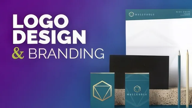
A real-time, unscripted walkthrough of one designer's full branding process, more useful for watching decisions unfold than learning explicit rules.
This course builds one fictitious brand, a life-coaching business named Malleable, from a blank document to a finished business card, letterhead, and standards manual. The arc is linear and logical on paper: type exploration, symbol design, color, business card, brand manual. In practice it plays out as a running commentary on one designer's taste, which is both the course's appeal and its limit.
The Design Process
The early lessons spend real time on typography, and this is where the course is strongest. Rather than picking a font and moving on, the instructor lines up serif, sans serif, and script options side by side, tries them in all caps and lowercase, and narrates why a softer lowercase script feels right for a coaching brand while a bold all-caps treatment does not. The symbol that follows comes from Illustrator's polygon tool: two overlapping shapes with their corners set to a rounded join instead of a sharp one, which softens an otherwise angular mark. A genuinely useful trick shows up here too, converting a live stroke into a fixed object through Object, Path, Outline Stroke, so the mark's line weight cannot distort if it is scaled later. That single move is the kind of detail worth the price of admission for anyone who has fought with stroke scaling before.
From Logo to Brand System
Once the mark is set, the course pushes it through the paces a client would actually expect: a gradient version, a single flat color version for print restrictions, and a grayscale version for cases where color reproduction isn't possible. The business card lesson pulls in Photoshop for texture work, layering a photographed gold surface under the logo using blend modes and a clipping mask, which is a reasonable way to show how vector and raster tools split responsibilities. The final lessons assemble everything onto Illustrator artboards as a branding standards manual, then reuse those same assets to build a letterhead in a few minutes, demonstrating how a locked brand system speeds up secondary collateral.
Where It Falls Short
The course's honesty about process is also its biggest liability as instruction. Long stretches consist of trying a variant, saying it does not feel right, and deleting it, with little articulated reasoning beyond personal preference. Someone hoping to learn transferable rules about when a script font signals warmth or how to choose a color palette systematically will come away with impressions rather than principles. The Photoshop segment assumes familiarity with tools like the magic wand and layer blending without walking through them, which sits awkwardly against a course pitched at intermediate Illustrator users. It rewards viewers who already have baseline software fluency and want to see a professional's workflow, but it does not function as a step-by-step method anyone could repeat on a different brand without filling in the reasoning themselves.
The standout
The most reusable single technique is outlining a live stroke into a fixed object, which stops a logo's proportions from warping when it gets scaled up or down.
What you will learn
- How to explore multiple typography directions (serif versus sans, script versus all caps) before locking in a wordmark
- How to build a custom geometric symbol from Illustrator's polygon tool combined with rounded corner joins
- How to lock a stroke's weight with Object > Path > Outline Stroke so a mark stays proportional when resized
- How to develop one logo into a full color system: gradient, single flat color, and black and white versions
- How to mock up a business card and bring raster textures in from Photoshop using blend modes and clipping masks
- How to lay out a multi-page branding standards manual across Illustrator artboards for client presentation
Best for: Designers who already know their way around Illustrator and want to watch an experienced brand designer's actual decision-making unfold on a real project.
Skip it if: Complete Illustrator beginners or anyone hoping for structured typography and color theory rather than one person's intuitive trial and error.