
Lettering for Package Design: From Sketch to Label
Jon Contino · Creative Director
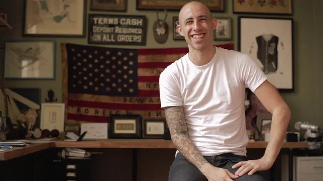
Jon Contino sketches a single Argentina wine label start to finish, but 35 minutes leaves little room to practice the lettering yourself.
A studio walkthrough, not a lettering tutorial
Jon Contino's class promises lettering for package design, but what it actually delivers is closer to a case study in creative direction. The bulk of the runtime is Contino narrating his own process on one real project, a Malbec label for an Argentine wine brand called Dogo, while the camera watches him talk through sketches and Illustrator files. Anyone expecting drills in constructing letterforms, spacing type, or building a custom alphabet will not find them here. The word "lettering" in the title is doing more marketing work than descriptive work.
What the class is good at is showing how a label actually gets made in a working studio, from a client's rambling brief through a mood board of reference images, illustration, and packaging examples, to a rectangle sketch with cut corners meant to echo an olive oil label. Contino talks through his own hierarchy decisions in real time: lock the logo position first, then the dog illustration, then the supporting text, because that is the order a shopper's eye will actually travel. That sequencing logic, get the most important mark right before touching anything else, is a transferable principle any label or badge designer could apply immediately.
The opening lesson on favorite hand-illustrated labels earns its place. Contino breaks down an old whiskey label and a Wiffle ball box specifically for how they cheated their way to more visual richness than their print budgets allowed, using thin and thick line work to simulate shading in a one-color print, or letting a white box stand in as a third color alongside black and orange ink. This is concrete, checkable craft knowledge, the kind of thing a student can go test on their own project the same afternoon.
Where the arc thins out
The middle lesson on translating a mood board into sketches runs long on Contino's internal monologue about what the Dogo brand should feel like, heritage, boldness, Argentine pride, and comparatively short on the mechanics of getting from a page of thumbnails to a locked composition. He mentions "playing with different sizes" and flipping the logo treatment "about a thousand times," but the actual decision criteria stay mostly implicit. A student trying to replicate the process on their own brief would have to infer a lot.
The final lesson, working with the top design, compresses the most technically useful stretch, moving inked line art into Illustrator and layering in shadow and color, into under six minutes. That step is where most students would want the most detail, since it is the one place software technique actually enters the class, and it is the one place the pacing feels rushed rather than deliberate.
At 35 minutes across four real lessons, this sits closer to an extended studio tour than a full class. There are no exercises to build a letterform from scratch, no critique of student work, and the single case study never widens into a second example that might show the process holding up under different constraints. For an intermediate-level tag, the technical bar is not high. What is here is worth watching once for the budget-print thinking and the mood-board-to-sketch discipline, but it will not teach anyone to letter, and it should not be picked up expecting that.
The standout
The breakdown of squeezing three or four apparent colors out of a two-color Wiffle ball box print, using halftones and the white substrate as a third color, is a genuinely reusable budget-design trick.
What you will learn
- How to build a client mood board and translate scattered references into a coherent visual language
- How to sequence a label design from research through sketching through final production art
- How to sketch a full label layout by locking the most important element first, then building hierarchy around it
- How to fake extra print colors on a limited budget using halftones, negative space, and the substrate itself as a color
- How to move an inked black-and-white sketch into Illustrator and start testing color and shadow treatments
Best for: Working illustrators and designers who already draw and want to see how a professional structures a real label commission from brief to final art.
Skip it if: Total beginners hoping to learn hand-lettering technique or typography fundamentals from scratch, since no letterforms are taught step by step.