
Illustrated Lettering: Design a Book Cover with Jessica Hische
Jessica Hische · Letterer and Illustrator
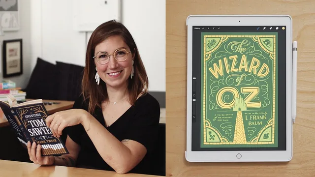
Jessica Hische walks through her entire book-cover process from reading to color comps, but the payoff is process literacy, not finished digital art.
Jessica Hische's class is not really a lettering tutorial. It is a process tutorial that happens to end in lettering, and that distinction shapes everything about how it should be approached.
The course opens by asking students to pick a book, and Hische spends real time explaining why that choice matters before any drawing happens. She works through The Wizard of Oz, specifically the 1939 film novelization rather than Baum's original, and uses it to demonstrate a reading method: keep a loose, disorganized notes sheet nearby while reading, capturing both plot beats and stray sensory details like the pattern on a curtain. She is explicit that visual research at this stage is a trap, because looking at existing covers too early narrows what your brain will let itself imagine.
From Notes to Concept
The audience section is where the class earns its "intermediate" label. Hische treats audience as a design constraint with teeth, not a marketing afterthought. She walks through how a children's edition, a limited box set, and a gift-shop edition of the same book would each demand different color saturation, ornament density, and typographic complexity, using the Malcolm Gladwell pop-psychology cover trend as a case study in how genre visual language calcifies. This section will be most useful to students who already have client-facing design instincts, since it assumes you understand why matching or bucking a genre convention is a real strategic choice.
The sketching lessons are the technical core. Hische demonstrates symmetrical versus asymmetrical layout logic using nothing more than a rectangle and rough thumbnails, then moves into baseline treatments, straight, arched, angled, or undulating, and explains each as a functional decision rather than decoration. An angled baseline, for instance, buys more horizontal room for a long word like "Frankenstein" than a straight one would. That kind of concrete reasoning, tied to an actual constraint rather than aesthetic preference, is the strongest teaching in the class.
Letterforms and Limits
The letterform sketching lessons get more granular still, covering skeleton choice, case, weight, contrast, and where swashes and terminals belong relative to a letter's main strokes. Hische's rule of thumb, no more than three styles on a single cover, is the kind of practical guardrail that prevents the amateur mistake of overdecorating. The color lesson, arriving late, is constrained by a three-foil production budget, which forces a lesson in how far a limited palette can stretch when paired with metallic and matte finishes.
Where the class falls short is in its ending. It closes at the color-comp stage, the point where Hische says she would send work to a client for feedback, and stops there. Anyone expecting to leave with a finished, presentation-ready digital illustration will be disappointed, since the vectorizing and rendering work is described rather than demonstrated. The class also assumes a baseline comfort with drawing and composition that a true beginner will not have; it teaches how to think about a cover, not how to hold a stylus. For an illustrator or letterer who already has technical chops and wants a sharper, more deliberate front-end process, though, it delivers exactly what it promises.
The standout
The baseline-treatment breakdown, where straight, arched, angled, and undulating lines are shown as deliberate tools for controlling word length and rhythm on a page, gives lettering students a genuinely transferable trick.
What you will learn
- How to mine a book for visual material by reading with a running notes sheet instead of a highlighter
- How to verbally brainstorm word associations before touching a pencil so early images do not lock in your concept
- How to define an audience for a design (children, collector, gift-shopper) and let that choice drive scale, ornament, and color
- How to build typographic hierarchy through symmetry versus asymmetry and baseline treatments (straight, arched, angled, undulating)
- How to sketch letterforms by first choosing skeleton, then case, then weight and contrast before adding swashes or terminals
- How to commit to a workable color palette when production is limited to a small number of foil colors
Best for: Intermediate letterers and illustrators who already draw but want a repeatable concept-to-composition process for editorial or cover work.
Skip it if: Total beginners looking for step-by-step Procreate tool instruction or anyone wanting a polished final vector file by the end of class.