
Iconic Logo Design: Brainstorm & Refine Unique Concepts
Will Paterson · Graphic Designer & Hand Lettering Artist
A tight, well-taught brainstorming method for logo concepts, but the Illustrator execution moves too fast for true beginners to follow along.
Will Paterson's class treats logo design as a two-stage problem: first generate volume, then refine one idea into a finished mark. That structure is the course's biggest strength, and it holds up across all ten lessons, from the opening definition of a good logo through to mockup presentation.
The concepting method is the real lesson
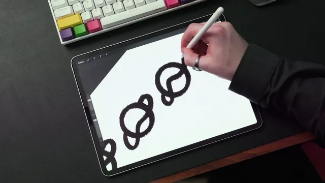
Before any sketching, the course has you build a keyword mind map from a client brief, in this case a fictitious astronomy app called Origin. Words branch into other words (planets leads to orbit, orbit leads to speed) until a mess of associations sits on the page. That mess becomes raw material for the sketching phase, where Paterson imposes a hard rule: thirty seconds per idea, no erasing, no perfecting. He calls the result "failing to success," and watching a rough pin sketch mutate into a rocket, then get abandoned for a cleaner planet-and-orbit icon, is a more honest look at how concepts actually develop than most design tutorials offer. The mood board step, pulling color and imagery references before drawing begins, gives the sketching phase a boundary so ideas don't wander off-brief.
The evaluation criteria are simple but well-argued: a logo needs to work at both large and small scale, stay legible, and match the tone of the industry it represents without becoming a cliche of that industry. Paterson demonstrates this with a deliberately bad example (comic sans for a funeral parlor) that makes the point faster than a paragraph of explanation could.
Execution outpaces explanation
Once the course moves into Illustrator, the pacing shifts noticeably. The offset path and shape builder techniques used to carve negative space into the planet icon are shown in full, but the reasoning behind each click gets thinner, and someone without existing Illustrator habits will likely need to pause and rewatch. The same is true of the kerning correction on the wordmark, where Paterson nudges letters by eye and states plainly that this judgment takes years to develop, which is honest but not much help to someone trying to replicate the skill in the moment. The Photoshop mockup section at the end is the weakest link: it shows the mechanics of swapping a Smart Object but treats sourcing a mockup file as a solved problem, when it is really a separate skill and cost.
What the course does not offer is much range. One brief, one concept, one execution path. There's no comparison of that process against a different kind of brief, say a wordmark-only brand or a highly illustrative logo, so it's unclear how far the method stretches beyond the space-app example. The final result is polished and the reasoning behind each concept choice is narrated clearly, but the class is really teaching one workflow demonstrated once, not a toolkit tested against varied problems.
For a designer who already knows their way around Illustrator's pen tool and shape builder, the concepting framework alone is worth the runtime. For anyone newer to the software, expect to supplement the technical sections with outside tutorials.
The standout
The 30-second rapid-sketch method, paired with the instruction to write down every stray connection as it appears, is a genuinely transferable way to break through blank-page paralysis on any logo brief.
What you will learn
- How to build a keyword mind map from a client brief to seed visual associations before sketching anything
- A rapid-sketching discipline (30 seconds per idea) that forces quantity over precision and surfaces unexpected concept connections
- How to identify a strong logo concept using simplicity, legibility, and appropriateness as evaluation criteria
- Vector techniques in Illustrator for converting a hand sketch into a clean icon, including the offset path and shape builder tools for negative space
- How to pair a logotype with an icon, including outlining type and manually correcting optical kerning
- How to source palette colors from a mood board and apply subtle gradients without breaking legibility
Best for: Designers who already have basic Illustrator fluency and want a repeatable concepting process, rather than someone learning vector software from scratch.
Skip it if: Complete beginners to Illustrator, since the vectorizing, kerning, and mockup sections move through menus and tool shortcuts at a pace that assumes prior software comfort.