
How to design a logo with golden Ratio
Mohamed Achraf · Graphic designer
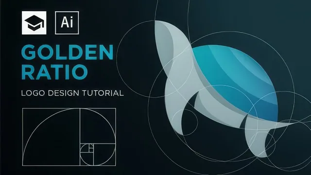
A fast, free walkthrough of a real Illustrator technique, but seventeen minutes barely scratches logo design.
What it actually covers
This course is a tight, single-purpose screen recording: construct a golden rectangle, pull golden circles out of it, and use those circles to build two logo marks, a fish and a turtle. It opens with the rectangle method, stacking squares and rotating them repeatedly until a golden rectangle emerges, then shows how to drop a circle into each square and align them all to a shared center. That five-minute setup is the foundation for everything that follows, and it is explained clearly enough that a viewer with basic Illustrator fluency can replicate it without pausing the video every ten seconds.
The fish logo section is short and mostly a warning. Mohamed Achraf builds a fish by intersecting a few circles and admits partway through that this is not really how professional logos get made this way, it just looks plausible after the fact. That kind of honesty is refreshing in a tutorial, and it sets up the real lesson.
The turtle logo and coloring
The turtle section is where the course earns its keep. Instead of freehanding shapes from circles, the instructor starts from a pre-made sketch, locks it in place, and overlays golden circles on top, aligning circle edges to the sketch's curves rather than resizing the circles to fit. That distinction, never resize the golden circles or you lose the proportion, is the single most useful piece of judgment in the whole course. From there, Shape Builder does the heavy lifting: dragging across unwanted circle fragments to delete them, clicking without Alt to merge remaining pieces into the turtle's body, shell, and legs. The outline view shortcut, Control+Y, gets used repeatedly to check alignment precision, which is a small but practical habit worth picking up.
The final lesson on coloring the turtle is denser than its five minutes suggest. It moves through building a base gradient, duplicating and offsetting shapes to create highlights, adjusting opacity and blend modes like Soft Light and Multiply, and using the Arc and Pen tools to hand-draw shadow shapes along the shell and legs. It is useful but rushed, more a demonstration to watch once than a lesson to follow step by step on a first try.
Where it falls short
At seventeen minutes across six lessons, the course cannot be anything but narrow, and it does not pretend otherwise. There is no discussion of when the golden ratio actually improves a logo versus when it is decorative math applied after the fact, no coverage of typography, client briefs, or how to develop a logo concept before opening Illustrator. The instructor sketches the turtle off-screen and simply presents it, skipping the conceptual step that matters most in real logo design work.
The narration is also a limiting factor. It is functional but dense with quick tool-name references and Illustrator shortcuts delivered at pace, which will frustrate anyone unfamiliar with the software's interface. This is not a course for someone learning Illustrator and the golden ratio at the same time.
Taken as what it is, a free YouTube tutorial repackaged for Skillshare, it delivers exactly one solid technique cleanly: using golden circles as an alignment scaffold over a sketch. Anyone already comfortable in Illustrator will get real value out of it in under twenty minutes. Anyone looking for a fuller logo design education should treat this as a single afternoon exercise, not a course.
The standout
The turtle logo lesson, which shows how to lock a scanned sketch behind golden circles and trace it into a finished vector outline, is the one technique worth the whole runtime.
What you will learn
- How to construct a golden rectangle from stacked squares in Illustrator
- How to extract golden circles from that rectangle using the Ellipse and Align tools
- How to build a logo shape by overlapping and intersecting circles with the Shape Builder tool
- How to grid a hand-drawn sketch with golden circles and trace it into clean vector lines
- How to apply gradients, opacity blending, and blend modes to add shading and dimension
Best for: Illustrator users who already know the basic tools and just want a concrete method for applying the golden ratio to a logo mark.
Skip it if: Total beginners to Illustrator or anyone wanting a broader grounding in logo design strategy, typography, or client work.