
Hey, Cool Shirt: Designing Effective T-shirt Graphics
Christopher Delorenzo · Graphic Artist
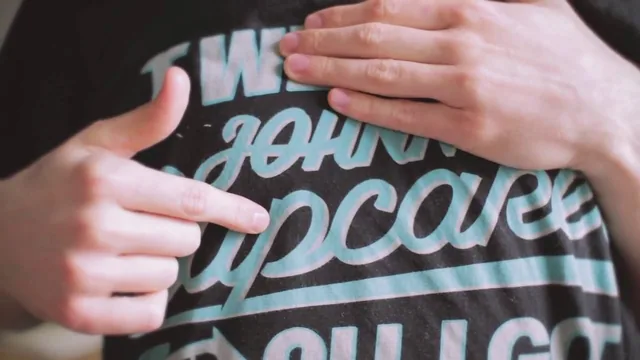
A Johnny Cupcakes designer walks through his real print-production checklist, useful mainly for the pre-press half most t-shirt tutorials skip.
From brand research to a finished sketch
The course opens with Christopher Delorenzo walking through his own portfolio from Johnny Cupcakes, using real shirts, including failures, to establish what makes a design work on fabric rather than paper. A Halloween release built around old horror-movie posters, packaged inside fake VHS tapes, sets up the core lesson before any software gets opened: research a brand's existing visual world first, then adapt it, not lift it. He also shows a design he calls an outright miss, a shirt too busy with clashing type styles, and uses it to make a specific point about restraint that a lot of design courses only gesture at in the abstract.
That research method becomes concrete in the sketching lesson, where Delorenzo pulls inspiration from vintage magician posters for his own class project, a Johnny Cupcakes-themed hypnotist design. He points out the angled, capitalized sans-serif type common across those old posters and the recurring head-and-crystal-ball motif, then shows how a poster layout has to be re-proportioned for a chest print rather than copied wholesale. The thumbnail-to-refined-sketch progression is quick but genuinely instructive, particularly the moment he explains why a realistic human face rarely works on a shirt and needs to be pushed toward caricature.
Where the course earns its keep: production
The typography lesson is the most transferable single technique here. Delorenzo builds custom letterforms from rectangles, adjusting counters and stroke angles by eye, then shows how individual letters should relate to each other, an S angled to echo an A, a curved E locking against a K. It is a compact, practical demonstration of custom lettering that does not require a font library.
The back half of the course, covering pre-press, is where it separates itself from typical illustration classes. Delorenzo demonstrates merging and reseparating colors in Illustrator using the Pathfinder tool, isolating a gradient before merging so it does not get flattened out, and using a clipping mask to fade a color to transparency. For anyone building from a hand-drawn or Photoshop file instead, he walks through the trapping technique, expanding one color region slightly into an adjacent one so a printer's registration doesn't leave a hairline of unprinted fabric between colors.
The tech pack lesson closes the course by translating a finished file into instructions a printer can act on without a phone call: Pantone Color Bridge Coated numbers for every color, placement measurements that scale up for larger shirt sizes, and a plain explanation of plastisol versus discharge printing and when each is appropriate. It is unglamorous material, but it is the part most design education skips entirely, and its absence is usually what causes a freelancer's first print run to come back wrong.
The course runs a lean 70 minutes and never slows down to explain basic tool functions, so anyone shaky on Illustrator's pen tool or Photoshop's selection tools will lose the thread during the production lessons. There is also no coverage of screen printing mechanics beyond the design file, no discussion of shirt fabric or garment selection, and only a passing nod to costs. As a focused walkthrough of taking a t-shirt graphic from a brand brief to a print-ready file, though, it delivers exactly what its outline promises.
The standout
The live Illustrator walkthrough of merging, separating, and Pantone-labeling colors for print, a step almost no other design course covers in this detail.
What you will learn
- How to research a brand's visual language and translate a poster-era aesthetic onto a chest-sized canvas
- How to build custom display type letter by letter using basic shapes instead of relying on existing fonts
- How to merge and separate colors in Adobe Illustrator with the Pathfinder tool to prep artwork for screen printing
- How to trap pixel-based artwork from Photoshop to avoid registration gaps between colors
- How to label Pantone Color Bridge Coated values and fill out a tech pack so a printer can execute the design without guesswork
- How to distinguish plastisol, light plastisol, and discharge printing and choose the right one for a given shirt color
Best for: Illustrators or graphic designers who already know their software and want the missing link between a finished digital design and a printable production file.
Skip it if: Total beginners to Illustrator or Photoshop, since the course assumes fluency with the pen tool, layers, and clipping masks and never explains them.