
Hand Lettering in Procreate: Fundamentals to Finishing Touches
Gia Graham · Designer, Letterer, Illustrator
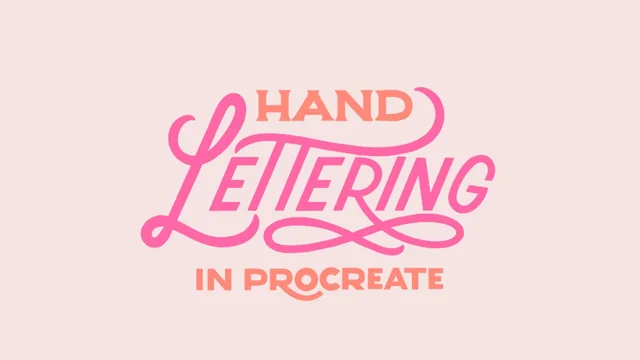
A structured, technique-heavy walk from lettering vocabulary to a finished flourished name piece, built for absolute beginners on an iPad.
A vocabulary-first approach to a hands-on craft
Gia Graham's class opens with something most lettering tutorials skip: definitions. Before touching a stylus, the course spends an entire lesson distinguishing lettering from calligraphy from typography, then another walking through the anatomy of a letterform, baseline, x-height, ascender, descender, arm, spine, counter, terminal. It is dry compared to what follows, but it pays off later when instructions reference "the shoulder of the H" or "add overshoot to rounded letters" without needing to stop and explain. For a true beginner, this groundwork removes the guesswork that usually makes early lettering attempts feel like copying rather than understanding.
The Procreate orientation lesson is similarly practical rather than exhaustive. It covers canvas size and DPI choices, which brushes work for sketching versus inking, how to build a custom brush set, and the Quick Shape tool for snapping rough lines into straight or curved ones. It is not a full app tutorial, and the course says as much, pointing beginners to outside videos if they need more. That restraint keeps the pacing tight.
Letter construction is where the class earns its keep
The middle section is the real substance: individual lessons on sans serif, serif, script, illustrative, and "tricky" letters (S, O, W, N), each broken into a skeleton sketch, a thickness pass, and a cleanup pass. The method repeats consistently, draw the basic strokes, identify which are upstrokes and downstrokes, thicken the downstrokes, then refine on a new layer, which turns an intimidating blank canvas into a repeatable process. The S and O lessons stand out for offering genuine problem-solving tricks, like slicing an oval diagonally to guide the letter's counters and spine, or using Procreate's symmetry tool to draw a perfectly even O.
Building full words gets its own lesson, covering letter spacing through "letter blocks" and the visual adjustments needed when an angled letter like A appears to sit farther from its neighbor than it actually does. This is a detail many lettering classes gloss over, and its inclusion shows real teaching experience.
The finishing-touches stretch, inking, color with clipping masks, drop shadows, ligatures, and flourishes, moves quickly but hits the key techniques: alpha lock for fast shadow recoloring, layer-based inline details, and a clear warning that flourishes and ligatures should support legibility rather than overwhelm it. The flourish lesson in particular uses the instructor's own earlier work as a before-and-after example, which lands better than an abstract rule would.
Where it falls short
The project structure, phased around lettering a single name, keeps the work grounded, but the class assumes steady access to an iPad, Procreate, and a stylus with pressure sensitivity, so anyone without that setup gets little value from the demonstrations. The style-guide lesson near the end, on building a personal reference library and finding inspiration without imitating, is thoughtful but abstract compared to the hands-on letter drills, and feels like a lecture dropped into a course otherwise built on doing. Advanced letterers looking for composition theory, layout for long phrases, or more elaborate flourish work will find this too foundational, the instructor herself points toward a follow-up class for that. As a first course in digital lettering, though, it is dense with usable technique.
The standout
The letter-by-letter construction lessons that break down stroke order and thick/thin placement for each tricky character (S, O, W, N) using simple guide shapes like stacked circles and sliced ovals.
What you will learn
- The vocabulary that separates lettering, calligraphy, and typography, plus letterform anatomy terms like baseline, x-height, overshoot, bowl, and counter
- How to set up Procreate for lettering work: canvas size and DPI, brush selection for sketching versus inking, custom guides, and the Quick Shape snapping tool
- How to construct serif, sans serif, script, and illustrative letterforms letter by letter, including where upstrokes stay thin and downstrokes go thick
- How to space and align multiple letters into a finished word using letter blocks and the transform tool
- How to ink a pencil sketch cleanly and add color with clipping masks and the smudge tool
- How to add drop shadows, inline detail, ligatures, and flourishes without compromising legibility
Best for: Complete beginners to digital lettering who own an iPad and Procreate and want a structured, vocabulary-first path from blank canvas to a finished piece.
Skip it if: Anyone who already knows letterform anatomy and stroke contrast and just wants advanced flourish or composition techniques, since those get comparatively little runtime here.