
Hand Lettering Essentials for Beginners
Mary Kate McDevitt · Lettering and Illustration
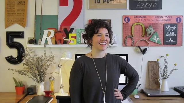
A beginner course that skips drawing technique entirely and instead teaches the professional workflow of concepting, sketching, and refining a lettering piece before ink ever touches paper.
This is not a course about pretty alphabets. It is a course about process, and that distinction matters for what kind of beginner will get value from it.
Mary Kate McDevitt structures the class around her own professional workflow rather than around drawing technique in isolation, and the arc is genuinely sequential: pick a short, personal phrase, research it with mood boards and vintage reference books, warm up by drawing one word in nine different lettering styles, then move through thumbnails, sketch, refined sketch, and final ink. Each stage builds directly on the last using one running example project, a book-cover concept for the phrase "knitting like an electric nan," so the viewer watches a single idea evolve from a scribbled word list all the way to a finished inked illustration rather than jumping between disconnected demos.
What the lessons actually teach
The strongest material is the section on understanding hand-drawn letters, where the four-step construction method (frame, add weight, add style details, add finishing touches) turns "draw a fancy letter" into something a beginner can actually execute. Paired with it is a genuinely useful beginner-mistakes lesson: which strokes should be thick versus thin on script letters, why W's and N's need their thick strokes on the parallel verticals rather than the diagonals, and how sloppy spacing causes serifs to collide. These are the kind of specific, correctable errors a self-taught letterer would otherwise spend months discovering on their own.
The tool lesson is refreshingly unglamorous: a number 2 pencil, a softer Blackwing for darker sketches, a Uni-ball pen for inking, plus a ruler and compass. No airbrushes, no proprietary brush sets, nothing that requires a shopping trip beyond a stationery aisle. The compass and ruler turn out to be load-bearing tools throughout the class, used repeatedly for curved lettering, drop shadows, and symmetrical ornamentation, and the instructor is honest on camera when her own freehand curve warm-up comes out crooked and needs a second pass with the compass.
Where it falls short
The class is explicitly about the "first steps" of lettering, concepting and sketching, and it ends the moment the final ink drawing is finished. There is no color, no digital cleanup, no scanning or vectorizing workflow, even though the instructor references taking these drawings into a computer several times. A beginner expecting a start-to-finish poster or shirt design will come away with only half the picture.
The pacing also leans heavily on watching someone else draw. Long stretches of the sketching and inking lessons are essentially screen-recorded demonstration with light narration, which rewards a viewer who pauses and draws alongside but will feel slow to anyone hoping for a quick reference. And because the entire class hinges on one worked example, some of the advice (like the specific ornamentation choices for "electric nan") is illustrative rather than universally applicable, so a viewer working in a very different style may need to translate the lessons rather than copy them directly.
Taken as what it claims to be, an introduction to the thinking that precedes good lettering rather than a font-drawing tutorial, it delivers. Anyone who finishes it will have a repeatable process for research, warm-up, thumbnailing, and refinement that applies well beyond the specific styles shown on screen.
The standout
The four-step letter construction method (frame, weight, style details, finishing details), demonstrated directly on the alphabet, gives beginners a repeatable formula for building any decorative letterform from scratch.
What you will learn
- How to choose and research a short, personal phrase and build a mood board from historical reference material
- How to warm up by drawing one word in nine different lettering styles (script, black letter, sans serif, dimensional, and more)
- How to identify and fix the most common beginner mistakes: reversed thick/thin strokes on scripts, W's and N's, and X-height misalignment
- How to break decorative letterforms into four repeatable steps: frame, weight, style details, finishing details
- How to move a design from loose thumbnails through a tightened pencil sketch to a final inked drawing using a light table
- How to use a ruler and compass to keep curved lettering, drop shadows, and symmetrical ornamentation even and clean
Best for: A complete beginner to lettering who wants a real production workflow, not just pretty alphabets to trace, and is willing to draw the same word five or six times to get it right.
Skip it if: Anyone hoping to learn calligraphy pen technique, digital vectorizing, or color and texture work, since the class stops at a finished black-and-white ink drawing.