
Great Graphic Design: Create Emotional, Gripping Typographic Art
Sophia Yeshi · Graphic Designer and Illustrator
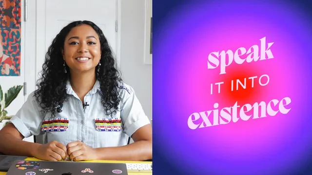
A gradient-and-texture typography walkthrough in Illustrator that teaches feel over fundamentals, best for designers who already know their way around the tool.
Sophia Yeshi's class promises a crash course in graphic design fundamentals and delivers something narrower and more useful: a guided pass through her own process for turning a quote into a bold, gradient-soaked typographic piece in Adobe Illustrator. At 73 minutes across twelve lessons, it moves fast, and it works best when judged for what it actually is rather than the fuller design education its blurb gestures at.
Structure and Technique
The course opens with two lessons that are more mood-setting than instructional, covering why Yeshi centers her work around emotion and a rapid tour of contrast, rhythm, pattern, color, balance, and whitespace. These are useful as vocabulary but stay conceptual. The real teaching starts once Illustrator opens: setting up a 1080x1080 artboard, sourcing type from sites like Fonts In Use and Behance, and then building the piece's signature effect, a gradient drop-shadow made by duplicating and locking a text layer, outlining the type to convert it to editable vectors, and blending two colored copies at a tight two-pixel distance. It is a specific, well-explained technique that any intermediate Illustrator user could lift directly into their own work.
From there the course layers in a radial gradient background, hand-drawn organic shapes clipped into the gradient text using the Pathfinder Unite tool, and a pass through the Recolor Artwork tool to generate multiple palette options from a single composition. The final lesson adds paper and grunge textures via Color Burn and Multiply blend modes, plus a grain effect, to give the flat vector work a printed, tactile finish. By the end there are six variant artboards of the same quote, each with a different color mood, which nicely demonstrates how far one composition can stretch with color and texture alone.
What Works and What Doesn't
The strongest stretch is the middle third, where Yeshi narrates her own Illustrator shortcuts in real time: locking layers to avoid dragging references around, using Alt with the pencil tool to smooth hand-drawn shapes, switching gradients to RGB to avoid muddy transitions. These are the kind of small, accumulated habits that separate someone who has used Illustrator a lot from someone who hasn't, and they are the course's real value.
Where it falls short is coverage. Despite the "basic principles of graphic design" framing, there is no layout grid work, no typographic hierarchy beyond pairing two typefaces, and nothing on composition for anything other than a square social quote graphic. A viewer with no prior Illustrator experience will struggle to keep up once outlining, blending, and clipping masks start stacking on top of each other without much explanation of the underlying tool logic. The class is also narrow by design, producing one type of output: an inspirational quote graphic in Yeshi's signature bold, high-contrast, gradient-heavy style. Anyone hoping to develop a personal design voice distinct from hers will need to look elsewhere for that guidance, since the class teaches her specific aesthetic more than a transferable design process.
As a short, technique-focused watch for someone who already opens Illustrator with some confidence, it earns its place. As an introduction to graphic design principles, the title oversells what is really a stylized tutorial in one designer's gradient typography workflow.
The standout
The gradient text-shadow technique, built by locking a duplicate text layer, outlining the type, and blending two colored copies at a two-pixel step distance, is a genuinely reusable Illustrator trick worth the price of admission alone.
What you will learn
- Applying contrast, rhythm, pattern, balance, and whitespace as deliberate compositional choices, not just design vocabulary
- Building a Pinterest-based reference board and pulling color, type, and composition cues from it before opening Illustrator
- Setting up artboards, outlining type, and building a gradient text-shadow effect using Blend tools between two duplicated text layers
- Applying circular and linear gradients, then using the Recolor Artwork tool to test multiple palettes fast
- Drawing loose organic shapes with the pencil tool, smoothing them, and clipping them into a gradient text block for a layered illustrative effect
- Layering paper, grain, and grunge textures with blend modes like Color Burn and Multiply to add tactile finish to a flat digital design
Best for: Designers with working Illustrator fluency who want to expand their type-and-color toolkit and are drawn to Sophia Yeshi's bold, gradient-heavy, emotionally-driven aesthetic.
Skip it if: Total beginners to Illustrator, anyone hoping for a broad graphic design curriculum, or designers who want a more restrained, minimalist visual style.