
From Watercolor & Pencil Drawing to Logo Design & Abstract Painting
Karina Eibatova · Use a pencil as a magic wand
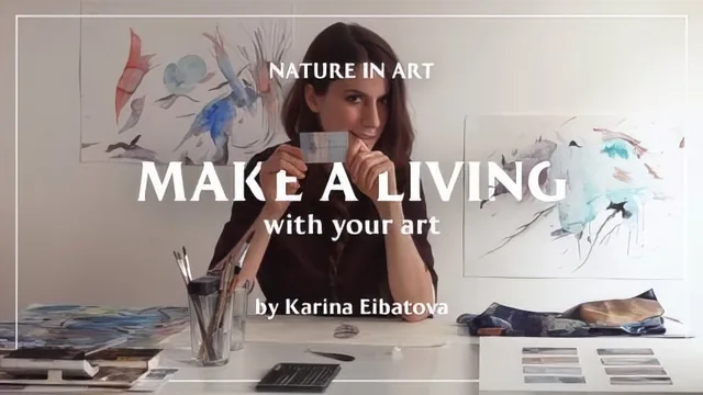
Twenty-five minutes of watching a logo get painted, scanned, and Photoshopped, with almost no technique actually explained.
What the course actually covers
The class is structured as three demonstrations bookended by a short introduction: a watercolor painting of a mineral turned into a fashion logo, a detailed pencil drawing of a feather turned into another client mark, and a short abstract painting made from a discarded sketch. Each demo follows roughly the same arc: sketch, paint or draw, scan, then rework the result in Photoshop. That repetition gives the course a clear shape, but it also means the same handful of ideas get recycled three times rather than deepened.
The watercolor segment is the most complete of the three. It shows a light-to-dark layering order, the use of a wide brush for the first wash, and a wet-brush blending technique for gradients. It also makes a genuinely useful point: erase pencil guidelines almost completely before painting over them, since graphite lines get sealed under watercolor and cannot be removed afterward. That is a specific, correct piece of technique that a beginner could apply immediately.
The pencil drawing segment leans heavily on a sped-up demonstration of shading a feather, with the pencil-sharpening-then-sandpaper trick as its one concrete takeaway. Beyond that, the instruction stays vague, amounting to encouragement to "work with the flow" and adjust shading by eye. Viewers hoping to understand construction, proportion, or how to build form from graphite tone will not find that here.
The abstract painting closer is the loosest section, essentially demonstrating how oil-based marker resists or interacts with wet watercolor to create texture. It is visually pleasant but offered without much explanation of why the materials behave that way or how to control the effect deliberately.
Where it succeeds and where it doesn't
Photoshop post-production is the course's real center of gravity, even though the marketing frames it as a drawing and painting class. The dodge and burn work on the feather, the Selective Color recoloring of the mineral logo, and the Pen tool selection for isolating a scanned drawing are all shown in enough sequence to follow, and they represent the most reusable skills in the entire 25 minutes. Someone comfortable in Photoshop already will get more out of this course than someone hoping to learn to paint.
The course's core weakness is pacing. Because it compresses three separate creative processes and their retouching into a short runtime, most of the actual painting and drawing footage is sped up with narration layered over it rather than explained step by step. The result feels more like a portfolio walkthrough than instruction: interesting to watch, but light on anything a learner could reliably reproduce. There is also no real project brief or exercise for the viewer to complete alongside the demonstrations, so it functions better as inspiration and a glimpse into a working illustrator's process than as a skills-building tutorial.
The standout
The Selective Color and dodge/burn walkthrough for turning a scanned watercolor into a client-ready, recolored logo asset is the one segment with real transferable Photoshop value.
What you will learn
- How to sketch a rough watercolor shape before committing to final lines, then erase pencil marks so they don't show through paint
- The order of operations for watercolor layering: light washes first, darker shades and fine line details last since watercolor can't be lightened once applied
- A pencil-sharpening trick using sandpaper after knife-sharpening to get finer detail lines
- How to select a scanned drawing with Photoshop's Pen tool and isolate it from its background for logo use
- Basic Photoshop retouching moves: Selective Color for full recoloring, dodge and burn for shadow and highlight control, and the Stamp tool for cleanup
- How to turn leftover or 'failed' sketches into a separate abstract painting using oil-based marker and rotated washes
Best for: Hobbyist painters who enjoy watching a working illustrator's process and want a loose sense of how personal artwork becomes commercial logo material.
Skip it if: Anyone wanting step-by-step instruction in watercolor technique, pencil shading, or Photoshop tools they can follow along with and reproduce.