
Exploring Brand Identity: Design a Brand Icon
Benny Gold · Graphic Designer & Founder at Benny Gold
A 36-minute masterclass in the thinking behind logo design, not the software, built around one real client icon done start to finish.
Benny Gold's class promises a look at how a single icon gets made, and it delivers exactly that: one project, the Highsnobiety H-and-crown mark, walked from a client conversation to a finished vector in under 40 minutes. The structure is a straight line rather than a loop back through revisions, which keeps the pace brisk but also means viewers see one version of "the process" rather than the messier reality of client feedback rounds.
The most useful lesson here is the word-association exercise in the second lesson. Gold writes the client's own words on paper (in this case "premier" and "authority"), then free-associates outward until visual nouns emerge, in this case landing on "king" and, eventually, "crown." Watching the page fill up and get circled and highlighted makes an abstract idea (how do you turn a brand statement into an image) into something anyone can replicate with a pen and a blank sheet. This is the part of the class most worth returning to, because it is transferable to any branding project, not just icons.
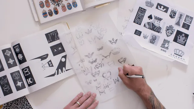
The research and sketching lessons that follow are shorter on process detail. Gold explains that he pulls physical books on heraldry and historic typefaces and traces over references on translucent paper to avoid "starting over," but the class does not spend much time on how to evaluate which references are worth pulling or how many sketches is enough before moving to digital. The advice to avoid "analysis paralysis" by presenting only three concepts to a client is a useful rule of thumb, but it is stated rather than demonstrated across multiple options, since the whole class tracks a single concept.
The Illustrator Section
The digitizing lesson is where the class gets most technical, and also where it moves fastest. Gold works through building the symmetrical crown-H shape using the Pathfinder panel, mirroring one half across a center line, rounding corners to avoid a "computer-made" look, and using the Divide and Unite functions to merge separate pieces into one clean path. Anyone without prior Illustrator experience will likely need to pause and rewatch this section, since tool names and keyboard shortcuts go by quickly and are not captioned or slowed down for a beginner audience despite the class's "beginner" label.
What the class does not cover is arguably as important as what it does. There is no discussion of typography pairing, color theory, or how the icon fits into a larger identity system (business cards, letterhead, a style guide). Gold explicitly frames this as intentional, the class is about the icon alone, not the full brand package, and that scoping is honest rather than a shortcoming.
For a designer who already has basic Illustrator fluency and wants a repeatable framework for concept development, particularly the word-association method, this class earns its short runtime. For someone hoping to learn vector tools from scratch or build a full brand identity, it will feel thin, and the pacing in the finalizing lesson may frustrate rather than teach.
The standout
The word-association exercise, where writing a client's own language on paper and circling recurring patterns turns a vague brief into a single concrete concept before any sketching starts.
What you will learn
- Running a word-association exercise that turns client language into a concrete visual concept
- Pulling and curating reference material (heraldry, historic typefaces, classic trademarks) without copying it directly
- Sketching on translucent tracing paper to layer and refine an idea by hand before touching software
- Building a symmetrical icon in Illustrator using the Pathfinder tool, mirroring, and rounded corners for a hand-made feel
- Stress-testing a finished mark at different sizes and in reverse color before presenting it to a client
- Presenting a logo mockup applied to real-world contexts (website, T-shirt, business card) to help a client sign off
Best for: Beginner-to-intermediate designers who already know their way around Illustrator and want a process for concept development, not a software tutorial.
Skip it if: Anyone needing to learn Illustrator basics, vector drawing fundamentals, or a broader brand identity system beyond a single icon.