
Easy Setup For Print: Design a Unique Business Card in Illustrator, Photoshop, or InDesign!
Jon Brommet · Crusoe Design Co.
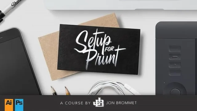
A fast, practical walkthrough of print-file setup that pays for itself the first time a printer rejects your file for missing bleed.
This course promises exactly one thing and delivers it: it teaches how to take a business card design from screen to print without the file bouncing back from the printer. It does not teach graphic design, branding, or how to come up with a card concept. Anyone expecting help with layout or typography choices should look elsewhere. What it covers instead is the unglamorous, easily-overlooked mechanics of print production, and it covers that narrow slice competently.
Structure and pacing
After a brief intro and project overview, the course opens with a genuinely useful terms lesson: bleed, trim, and safe margin are demonstrated with a mock sheet and a red "guillotine" line showing why a shift in the cutting blade can clip artwork that has no bleed. That single demonstration does more to build intuition than most written explanations of the same concepts. From there the course walks the same basic setup, an eighth-inch bleed, quarter-inch safe margin, 3.5 by 2 inch trim, through Photoshop, Illustrator, and InDesign in turn, explicitly ranking the three by how well-suited each is to print work (Photoshop worst, InDesign best). Repeating the same setup three times is slightly padded for anyone who only uses one program, but it also makes the course usable regardless of which application a student already owns.
Specialty techniques and output
The middle stretch covers Pantone spot colors, die lines for custom die-cut shapes, and foil or spot-varnish effects, each built the same way: draw a shape, assign it a distinct spot color or swatch, and label it clearly so the printer's prepress team knows what to do with it. The explanation is practical rather than theoretical, right down to naming the swatch "dieline" so nobody mistakes it for printed ink. The most substantial technical lesson is the one on transparency flattening, where a drop shadow sitting on top of vector artwork is expanded and shown to separate into a bounding box that can print as a visible rectangle rather than a smooth blend. That single explanation, plus the fix of rasterizing the artwork before output, is worth more than the rest of the specialty-effects lessons combined, since it addresses a failure mode that is invisible on screen and only shows up after money has already been spent on a print run.
The output lesson closes the loop with concrete steps: outlining fonts or converting text to smart objects, using File > Package in Illustrator and InDesign to bundle fonts and linked images, and exporting a press-quality PDF with trim marks and bleed settings baked in. A bonus lesson on Photoshop's newer multi-artboard workflow is a fair, if minor, addition for anyone stuck without Illustrator.
Where it falls short
The course is thin on anything beyond file mechanics. There is no meaningful color theory, no discussion of paper stock beyond a passing anecdote about the instructor's own two-ply wood card, and no troubleshooting section for print vendor communication beyond "make sure they know about the die line." Sponsor mentions of a specific print shop recur often enough to feel like part of the curriculum rather than incidental. For a total run time just over an hour, though, the course does not waste time on filler unrelated to its stated goal, and a student who finishes it will not send a printer a broken file.
The standout
The transparency-flattening demonstration, showing exactly how a vector shadow over raster art can print as an ugly boxed halo unless you rasterize or expand the appearance first.
What you will learn
- How to build a print-ready business card file with correct bleed, trim, and safety margins in Photoshop, Illustrator, and InDesign
- How to convert flat colors to Pantone spot colors in Illustrator and InDesign for consistent print output
- How to create a die line layer for custom-shaped or laser-cut cards
- How to fake and set up foil stamping and spot varnish effects using gradients and spot color swatches
- How to spot and fix transparency-flattening problems before they cause banding or boxing on press
- How to package, outline fonts, and export press-ready PDFs for handoff to a printer
Best for: Someone who already designs in Photoshop, Illustrator, or InDesign but has never sent a file to a commercial printer and doesn't know what bleed, trim, or a die line actually means.
Skip it if: Anyone who already runs a regular print production workflow, needs advanced illustration or branding instruction, or wants deep coverage of a single program rather than a quick tour of three.