
Drawing & Painting Crystals & Gems Made Easy in Watercolor OR Gouache
Yasmina Creates · Artist & Creativity Cheerleader
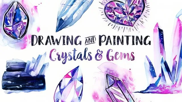
Nine step-by-step worksheets and a light-behavior trick make crystals and gems approachable in under an hour, if you already hold a brush confidently.
What the course actually covers
The class opens from a drawing standpoint before touching paint. Crystals get treated as collections of straight lines and simple planes, while gems are acknowledged as genuinely harder due to their faceted, irregular interiors. Nine downloadable worksheets carry most of the instructional weight here, breaking specific crystal and gem shapes into a three-step process: block in proportions, refine the planes, then add detail. Anyone uncomfortable with freehand line work is told outright to use a ruler, which is a practical concession rather than a stylistic cop-out.
The lighting section is where the course earns its keep. It draws a clear distinction between opaque objects, which shade the way most people already expect, and transparent ones, where the brightest area sits opposite the light source rather than on the same side. This is demonstrated with side-by-side comparisons of low-contrast and high-contrast lighting, tied back to the idea that contrast, not accuracy, is what reads as shine. The follow-up lesson translates that idea into a repeatable formula: pick a highlight tone, a mid-tone, and a shadow tone, then place them by intuition rather than strict physical logic.
Application across mediums
Three painting demonstrations apply the same underlying logic in different registers. The semi-realistic watercolor sequence uses wet-on-wet blending, layered glazes, and masking fluid to build up crystal clusters and a gem with soft gradients and gel pen highlighting. The ink and watercolor lesson trades precision for playfulness, using brush pens and micron pens with deliberately imperfect linework, splatter, and pulled-out color to create a looser, more whimsical feel. The gouache lesson introduces medium-specific handling, cheap brushes, no rewetting once dry, and a layered build-up approach, while showing how to blend gouache directly on the page for an oil-paint-like texture.
The closing lesson on a rainbow opal, clear quartz, and black tourmaline functions as a synthesis exercise, applying the earlier lighting logic to three genuinely different surface types in one sitting. It is a sensible way to end, since it forces the value and color decisions taught earlier into three visually distinct problems rather than one repeated formula.
Where it succeeds and where it thins out
The course is honest about its own shortcuts. It repeatedly tells students that shading does not need to be physically correct to look convincing, and that a viewer will rarely notice if lighting logic is bent for the sake of contrast. That permission-giving tone is likely the most reassuring part of the class for anyone who freezes up trying to render believable gemstones from scratch.
The tradeoff is that very little time goes toward color theory, paper selection, or brush control fundamentals, so the 49-minute runtime assumes a student who already has basic watercolor or gouache handling in place. The worksheets carry real value but are only referenced, not demonstrated line by line, in the main video content. For an intermediate painter looking for a fast, confidence-building shortcut to shiny, jewel-toned illustrations, the course delivers efficiently. For someone who needs the basics of watercolor control taught alongside the crystal-specific content, it will move too fast.
The standout
The transparent-object lighting rule, where the highlight sits opposite the light source rather than beside it, reframes how a student should approach shading any gem or crystal.
What you will learn
- How to break down crystal and gem shapes into simple geometric steps using the included worksheets
- The counterintuitive rule that transparent objects show their highlight on the opposite side from the light source
- A simplified light-and-shadow rendering method using only a highlight tone, a mid-tone, and a shadow tone
- How to paint gems and crystal clusters in three distinct styles: semi-realistic watercolor, cartoony ink and watercolor, and loose gouache
- Wet-on-wet watercolor blending, gel pen and white gouache highlighting, and the random-fill technique for faceted gems
- How to render a rainbow opal, a clear quartz, and a black tourmaline as three distinct light-behavior case studies
Best for: Intermediate watercolor or gouache painters who already control a brush and want a faster, more confident way to fake convincing gem and crystal lighting.
Skip it if: Absolute beginners to painting or those wanting rigorous, scientifically accurate gemology rather than stylized illustration shortcuts.