
Dirty Design With Draplin: Crusty Techniques to Create Truly Original Work
Aaron Draplin · Designer and Founder, Draplin Design Company
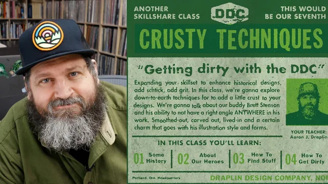
A working designer's crusty digital techniques for faking analog wear, taught fast and loose in under 75 minutes.
What it actually teaches
Draplin structures the class as a loose arc: a history lesson on paste-up mechanicals and letterpress degradation, a rundown of designers who inspired his rough aesthetic (Art Chantry, Aesthetic Apparatus, Kate Bingaman-Burt, Jason Sturgill), a tour through his personal archive of vintage Popular Mechanics and Golden Guide books, and then five demo lessons where he actually opens Photoshop and Illustrator. The demos cover a repeatable "copy machine" routine (blur, add noise, blur again, run the Stamp filter from the Filter Gallery, repeat until it looks degraded), converting photos to halftone dots by toggling between grayscale and bitmap mode, manually breaking up repeated letterforms so they don't look computer-perfect, physically distressing printouts by rubbing them on cement or crumpling them and scanning the results back in, and finally faking offset-printing color traps by isolating black values with Color Range and stacking colored duplicate layers.
Where it delivers
The halftone lesson is the most concrete and portable piece of instruction here. Draplin walks through specific settings (a 10-line frequency, a 45-degree angle, round versus line dot shapes) and shows how blurring and adjusting levels afterward smooths out the harsh bitmap edges. The typography lesson is also genuinely useful in a narrow way: the observation that repeated letters like the two Ls in a wordmark or the two Os in "book" look artificially perfect in a script or crusty typeface, and the fix of converting to outlines and manually offsetting the duplicate letterform, is a small but real craft insight that most digital-only designers would never think to check for.
Where it thins out
The class leans heavily on Draplin narrating his own screen actions in real time, which means some techniques are demonstrated more than explained. The "copy machine" degradation sequence, for instance, is really just blur, add noise, blur, apply Stamp, repeated with slightly different values each time until it looks right by eye, and there is no real framework offered for when to stop or how to judge the result beyond his own taste. The analog section, where he prints pages and rubs them on a sidewalk, traces faces on a window light box, and crumples paper, is charming and shows a genuinely different path to texture, but it is filmed handheld on a phone with visible pandemic-era production seams, and the technique itself boils down to "damage it, then scan it back in and clean up the vector with Color Range."
Verdict
This is a class about attitude toward imperfection as much as it is a tutorial. It works best as a supplement for someone who already has command of Photoshop and Illustrator and wants a handful of specific filter combinations and a permission slip to make their digital work look less sterile. It does not work as a first Photoshop or Illustrator course, since tool navigation is assumed throughout and steps move quickly with minimal repetition. The 73 minutes are front-loaded with history and inspiration, leaving under 45 minutes of actual hands-on demonstration, so anyone hoping for a dense, step-by-step production tutorial will find the pacing frustrating even though the ideas themselves are sound.
The standout
The step-by-step halftone conversion process, cycling a photo between grayscale and bitmap mode with specific frequency and angle settings, is the single most reusable, concretely explained technique in the course.
What you will learn
- Building a layered Photoshop 'digital copy machine' effect using Gaussian blur, noise, and the Stamp filter to simulate repeated photocopying
- Converting photos into gritty halftone dots by shifting between grayscale and bitmap mode and adjusting halftone screen frequency and angle
- Manually breaking up repeated letterforms in a typeface (like double Ls or Os) by converting to outlines and nudging anchor points for a hand-set look
- Taking digital prints off-screen and physically distressing them (rubbing on cement, crumpling, tracing on a light box) then scanning them back in
- Simulating offset printing flaws like ink traps and color misregistration by isolating black values with Color Range and layering colored duplicates
- Assembling a final printmaking-style composite by combining paper texture, multiply blend modes, and color separations
Best for: Designers with working Photoshop and Illustrator fluency who want a quick, personality-driven grab bag of texture tricks to layer onto otherwise clean digital work.
Skip it if: Beginners who need structured, step-locked tutorials, or anyone hoping for a polished, linear walkthrough rather than a stream-of-consciousness demo.