
Digitizing Calligraphy from Sketch to Vector
Molly Suber Thorpe · Calligrapher & Designer
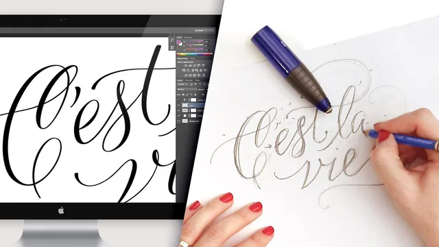
A working calligrapher walks through her actual studio workflow for turning ink calligraphy into a clean, reproducible vector logo.
This course sits at the intersection of two disciplines that rarely get taught together: pointed-pen calligraphy and production-grade vector cleanup. Molly Suber Thorpe, a working calligrapher and graphic designer, uses her own studio process as the curriculum, and that grounding in real client work is what gives the course its credibility. She states upfront that close to half her paid work ends up digitized, and the class is built around the exact question she says clients and other calligraphers ask her most: how does hand-drawn ink end up looking crisp and scalable without losing its handmade character.
From word choice to finished ink
The early lessons cover ground that other lettering classes tend to skip: how to actually choose what to write. Rather than jumping straight into pen technique, the course spends real time on selecting a word or short phrase, weighing single words against two-line phrases, and considering how letters with ascenders and descenders like g, y, t, and h create natural opportunities for flourishing. This section also shows a wide range of past client work, from wedding rubber stamps to tattoo lettering to a multilingual alphabet piece in Greek, which does a good job of showing how flexible the flourishing techniques are beyond a single logo format.
The imitation calligraphy lesson is a smart inclusion for anyone without pointed-pen experience: thickening downstrokes in pencil to fake the look of pressure-sensitive ink lets a beginner follow the entire process with nothing more than a felt-tip pen. The refinement and tracing stages that follow, done over a lightbox, are standard lettering practice but are demonstrated with enough specificity, including how to fix an accidental slip by simply redrawing over it, that a newcomer to the sketch-refine-trace cycle could follow along.
The digitizing core
The real value of the course is in its second half. The scanning lesson is short but precise about settings that matter: 1200 DPI minimum for logo work, TIFF format, and a black-and-white conversion before export. The Photoshop sequence that follows is the most technically dense part of the class, walking through layer masks, a solarized curves layer to expose dust and stray pixels, and a warp-based method for smoothing curves that look flat or bumped from natural ink variation. It is detailed to the point of being genuinely useful reference material rather than a quick pass.
The Illustrator lesson is where the course earns its reputation. Instead of relying on Illustrator's default Image Trace preset, which visibly destroys the thin hairline strokes that give calligraphy its character, the instructor manually tunes threshold and paths values and explains what each control actually does to line weight and smoothness. Saving that configuration as a reusable preset is a practical touch that turns a one-off demonstration into a repeatable studio tool.
The course does have real limits. At 113 minutes it moves briskly through some of the Photoshop and Illustrator steps, and someone with no prior exposure to layer masks or the pen tool may need to pause frequently to keep up. It also assumes access to Photoshop and Illustrator, which puts it out of reach for anyone without an Adobe subscription. But for a calligrapher who already has the penmanship and wants to make client-ready, scalable artwork out of their ink work, this is a well-organized and specific walkthrough of a process that is genuinely difficult to find taught step by step elsewhere.
The standout
The Image Trace walkthrough in Illustrator, where the instructor rejects the default auto-trace and manually dials threshold and paths settings to keep the thin hairline strokes intact.
What you will learn
- How to choose a word or short phrase suited to flourished calligraphic design, including ascender/descender considerations
- How to sketch imitation (faux) calligraphy with pencil before ever touching a pen
- How to refine a rough sketch into a final layout using a lightbox and tracing
- How to scan artwork correctly (resolution, format, black-and-white settings) for clean digitizing
- A specific Photoshop workflow for extracting pure black linework from a scan and removing dust, lumps, and stray marks
- How to hand-tune Illustrator's Image Trace settings (threshold, paths, corners) to preserve calligraphic hairlines instead of smoothing them away
Best for: Working calligraphers or lettering artists who already have pen skills and want to turn ink pieces into logos, stationery, or print-ready artwork.
Skip it if: Complete beginners looking to learn calligraphy penmanship itself, or anyone wanting a fast one-click vectorizing shortcut rather than a hands-on Photoshop and Illustrator process.