
Digital Illustrative Typography: Playing With Adobe Fresco
Jennet Liaw · Designer
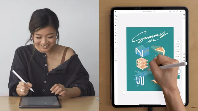
A 57-minute look inside one illustrator's sketch-to-color workflow, not a structured lesson in typography fundamentals or Fresco's toolset.
Jennet Liaw's class is less a typography course than a sit-alongside session with one illustrator working through a single piece from blank canvas to finished mockup. The project is fixed: pick a place name, brainstorm what it evokes, and turn those associations into illustrated letterforms. Liaw works through New York, and specifically summer in New York, landing on ideas like subway lines, basketball courts, and dripping ice cream that get folded into individual letters.
The structural backbone of the class is its most useful contribution. Rather than starting with finished letter shapes, Liaw builds a 3D perspective guide, a set of angled guide boxes duplicated across the canvas, one per letter, so the whole word sits on a consistent plane before any illustration begins. Basic letterforms go in first, roughly blocked out in shapes like Helvetica or Gotham, and only after that structure exists does the illustrative content get layered on top of it. That sequencing, structure before ornament, is the clearest transferable lesson here, and it would work for any hand-lettering practice regardless of the app used.
The Fresco-specific instruction is present but thin. The course covers opening a custom document, setting vector versus pixel layers, using the paint bucket to fill, the lasso and transform tools for duplicating illustrated sections, and layer grouping for combining elements. These are shown in passing, as steps taken to finish the New York piece, rather than explained as concepts with their own logic. Someone who has never opened Fresco will pick up the motions but not necessarily understand why a vector layer was chosen for the background versus a pixel layer for sketching, beyond the brief mention of resizing flexibility.
Where the course succeeds
The brainstorming and Pinterest research segments are the most genuinely instructive part of the class, because they model a thought process rather than a button sequence. Liaw's habit of jotting private notes in a notebook-style layer before touching any visual references, and the reasoning for turning to Pinterest over other platforms because it fields ugly, idea-first images unfiltered by personal branding, gives viewers something to actually apply to their own projects.
Where it falls short
The pacing skips over real time. Extended personal sketching sessions between the letter-drafting and coloring stages are compressed into a hard cut and a summary of what changed, which strands anyone trying to follow along in real time on their own artwork. The color stage is also handled loosely, more a personal preference walkthrough referencing retro sport ads than a method for choosing or building a palette. Viewers hoping for a grounded explanation of Fresco's brush settings, blend modes, or export formats will find each mentioned only as needed for this specific piece, never as a standalone reference.
The final product, a colorful illustrated word mocked onto a t-shirt and a mural, is genuinely appealing, and watching one artist's judgment calls in real time has value. But the class rewards viewers who already have some illustration confidence and are looking for a process to borrow, not those looking for a ground-up introduction to either lettering or the app itself.
The standout
The 3D lettering guide method, drawing perspective guide boxes and duplicating them as letter-spacing scaffolding, is the one repeatable technique worth taking the class for.
What you will learn
- Setting up a Fresco canvas with vector and pixel layers, including a transparent background and a paint bucket fill workflow
- Building custom 3D perspective guide boxes and duplicating them to block out letterform spacing
- Turning brainstormed personal references (places, objects, memories) into illustrated letterforms that still read as legible type
- Using layer opacity, grouping, and the lasso and transform tools to duplicate and reposition illustrated elements
- Filling and recoloring vector shapes with the paint bucket, including adjusting fill tolerance settings
- Mocking up finished artwork onto products like t-shirts and murals using blend modes and quick export options
Best for: iPad illustrators who already have basic drawing chops and want to see one working artist's personal process for turning brainstormed imagery into lettering.
Skip it if: Complete beginners to digital drawing or anyone wanting a structured, tool-by-tool tutorial on Fresco's full feature set.