
Design For Meaning: Creating Effective and Artistic Book Cover Designs
Peter Mendelsund · Associate Art Director at Alfred A. Knopf
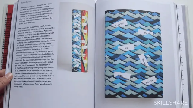
A famous Knopf art director distills book-cover design into a repeatable close-reading method in under an hour.
Peter Mendelsund's course is less a tutorial on software than a demonstration of how a working art director thinks before opening a design program at all. Across nine short lessons, he designs a single Skillshare-exclusive cover for Wordsworth's "I Wandered Lonely as a Cloud," and the poem's brevity turns out to be the smartest choice in the course: it lets him model an entire process, from first read to final comp, without the runtime ballooning into hours of manuscript summary.
The backbone of the class is a close-reading method. Mendelsund walks through the poem line by line, extracting concrete nouns (clouds, daffodils, stars), actions (wandering, dancing), and, more importantly, the poem's hidden turn: the "inward eye" in the final stanza that reframes the whole piece as being about memory rather than a walk in the countryside. He then sorts these findings into a checklist of narrative components, character, object, event, place, time, text, and tone, and shows how each one can become a visual on the cover. This checklist is the course's most transferable tool. It gives someone with little literary training a repeatable way to mine any manuscript for imagery, rather than relying on vague inspiration.
The design process itself
Once the reading is done, the course moves to paper sketching, and Mendelsund is candid about why he avoids the computer at this stage: software renders things too cleanly too fast, which discourages the freewheeling generation of bad ideas needed to find good ones. Watching him sketch clouds, footprints, and a wandering couch in quick, ugly thumbnails, then cross out the ones that overload the concept (clouds plus wandering text is "one concept too many"), is a clearer lesson in editorial restraint than most design courses manage. The subsequent screen-recorded session, where he builds three finished comps in a layout program, shows real decisions: flipping a flower graphic so it faces the same direction as the poet's eyes, testing type sizes against a strong image, and settling on a hierarchy between title and author name.
Where it falls short
The course's title promises "artistic" cover design broadly, but its scope is really the ideation phase. Software mechanics are skipped entirely. Anyone hoping to learn how to actually operate the layout tools, cut a mask, or apply an effect will need to look elsewhere, since Mendelsund narrates his intent rather than his keystrokes. Production techniques such as foil stamping, embossing, and die-cutting are named and their trade-offs explained, but only as considerations to raise with a production manager, not as skills demonstrated.
The 61-minute runtime is honest about the format: this is a masterclass in creative thinking, not a soup-to-nuts production course. For a working designer or illustrator who already has technical chops but wants a sharper method for turning a manuscript into a concept, that is exactly the gap worth filling. For someone starting from zero, both in reading closely and in operating design software, the course will feel like watching an expert think out loud without a map to follow behind him.
The standout
The live line-by-line reading of the Wordsworth poem, where Mendelsund pulls out concrete design elements (cloud, footprints, inward eye) directly from the text, is worth the watch on its own.
What you will learn
- How to break a text into components (character, object, event, place, time, tone) that translate directly into visual ideas
- A three-goal test for any cover: fidelity to the author's intent, commercial appeal, and personal creative growth
- How to sketch loosely on paper before touching software to avoid premature polish
- How to weigh production choices (foil stamp, embossing, stock photography versus illustration) against a real budget
- How to build word-association chains to break through creative block
- How to typeset a title and author name with a clear visual hierarchy
Best for: Graphic designers, illustrators, and self-publishing authors who already have basic design software skills and want a repeatable framework for turning text into imagery.
Skip it if: Total beginners looking to learn software tools like Photoshop or InDesign from scratch, since the course assumes comfort with a design program and skips tool mechanics.