
Design a Brand Identity: Create a Compelling Mood Board
Courtney Eliseo · Brand Clarity & Design
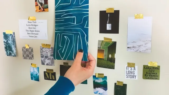
A tight 39-minute walkthrough of one designer's mood board process, useful mainly if you already have brief and client basics in hand.
Design a Brand Identity: Create a Compelling Mood Board is the third installment in Courtney Eliseo's brand identity series, and it functions less as a standalone design tutorial than as a documented process. Across five short lessons totaling under 40 minutes, the course walks through how one designer moves from a creative brief's tone words to a finished, client-ready mood board.
The structure is straightforward: definitions and purpose first, then research, then layout, then presentation. Mood Board Basics opens with a plain definition (a collage of images representing a brand's visual direction) and quickly moves into showing several real examples, including boards from other designers like Rowan Made and Maemae & Co, to illustrate that layout style is a matter of taste rather than a fixed rule. This comparative approach is a strength: it prevents the course from implying there's only one correct look for a mood board.
The research method
Research and Image Gathering is the most actionable lesson. It centers on taking the five tone words from a brief (using a sample client, Hudson Health and Wellness, with words like organic, healing, serene) and translating each into an image search. The practical value here is the troubleshooting: when a word like organic returns useless results such as recipes or infographics, the course suggests searching adjacent synonyms or asking what the word visually evokes instead of taking it literally. That single reframe, treat tone words as prompts to interpret rather than search terms to plug in directly, is the most transferable idea in the class.
Layout, balance, and defending choices
The Layout and Refinement lesson covers culling a large image pool into tone-labeled folders, then arranging roughly 15 images in Illustrator with an eye toward balance of color, size, and subject matter. The demonstration is narrated over screen capture, but it stays at a conceptual level: viewers hear about hiding the art board and grouping images by folder, not a granular breakdown of alignment, spacing, or specific Illustrator tools. Designers hoping to learn software mechanics will find this section thin.
Where the lesson earns its keep is in the closing review, where each finished image is checked against its tone word and the designer explains, out loud, why a piece of sea glass reads as organic or why an architectural photo reads as dependable. That habit of justifying every inclusion is a useful discipline, and it feeds directly into the final lesson on client presentation, which covers structuring a deck around background, tone, and the board itself, plus how to frame feedback questions so clients evaluate the whole mood rather than nitpicking individual photos.
The course delivers exactly what its blurb promises and no more. It is a process demonstration rather than a skills-building tutorial, so anyone without prior brief or tone-word work will feel like they've walked in mid-conversation, despite the claim that it can stand alone. There's minimal engagement with color theory, typography, or actual software technique, and the entire example runs through only one designer's personal aesthetic (asymmetrical, overlapping, roughly 15 images), which is acknowledged but still narrows the practical takeaway for anyone drawn to a different style. As a concise map of one workflow from brief to presentation, it succeeds; as a comprehensive mood-boarding education, it does not attempt to be one.
The standout
The tone-word review at the end of Layout and Refinement, where each image is mapped back to a specific tone word, gives a repeatable way to justify and defend design choices to a client.
What you will learn
- How to translate a client's tone words into an actual image search strategy
- Where to source mood board images (Pinterest, Dropmark, Unsplash, design blogs)
- How to cull and organize a large image collection into tone-based folders before laying out a board
- How to arrange roughly 15 images for visual balance in color, size, and subject matter
- How to review a finished board against each tone word to justify image choices
- How to structure a client presentation and guide feedback conversations around a mood board
Best for: Beginner to intermediate brand designers who already have a creative brief and tone words and want a concrete method for turning them into a client-ready mood board.
Skip it if: Anyone with no client project or brief in hand, or designers hoping for in-depth Illustrator layout technique rather than a conceptual walkthrough.