
Demystifying Graphic Design: How Posters Work
Ellen Lupton · Author and educator, MICA
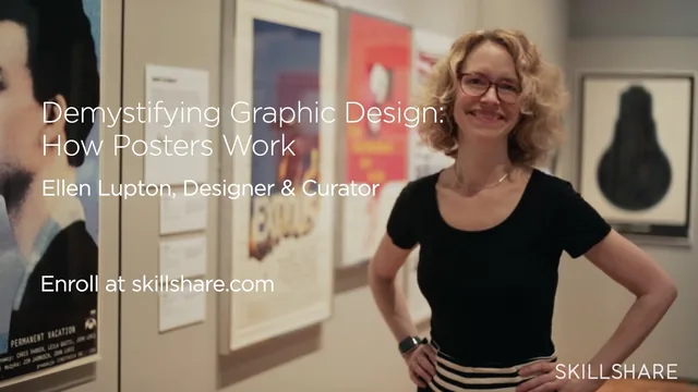
A one-hour trip through Cooper Hewitt's poster archive that hands beginners six genuinely reusable visual moves, taught by a working curator.
Ellen Lupton's class is built around a simple premise: posters are not dying, they are everywhere, and the six moves that make them work can be learned in an hour by looking closely at 4,000 examples from one of the world's best design collections. Lupton is Senior Curator of Design at the Cooper Hewitt, Smithsonian Design Museum and director of the MFA in Graphic Design at MICA, and that curatorial authority shows in the sheer density and quality of the reference images she pulls from, ranging from Polish film posters to World War II propaganda to Swiss psychedelia.
Structure and technique
The course moves through story, diagonal, simplify, overlap, focus, and surface as six discrete lessons, each opening with a principle and then walking through five to ten posters that demonstrate it. The strongest of these is the opening lesson on storytelling, where Lupton contrasts a literal World War II poster showing sailors escaping a torpedoed ship with a second poster on the same theme that shows only one drowning sailor staring directly at the viewer. The comparison makes a concrete, transferable point: a poster tells its story through a single frozen moment of peak emotional intensity, not a full narrative panel. The simplify lesson does similar work with the Stephen Palmer coffee cup study, showing how most people carry an identical mental icon of an everyday object, and how a designer can then twist that icon (a black light bulb instead of a glowing one) to create surprise.
The overlap and diagonal lessons lean more heavily on perceptual mechanics, explaining how aligned edges trick the eye into reading depth in a flat plane, and how converging lines borrow from linear perspective to suggest motion. These sections are clearly argued but slightly more abstract than the story and simplify lessons, and a beginner without any prior exposure to design theory may need to rewatch them once or twice.
The project and the museum visit
The hands-on portion has students choose a movie with a simple noun in the title and design a poster for it, following Lupton's own live demonstration of designing a poster for Hitchcock's "The Birds." This walkthrough is the course's most practical stretch: she brainstorms nouns and verbs, sketches loosely by hand and with ink, scans the sketches as bitmaps, and iterates through three distinct directions before settling on a bird cage shaped like a house. It is a genuine look at a professional's process rather than a polished final-answer reveal, and it shows failure and discarded ideas alongside the final poster. The museum walkthrough segment, filmed inside the Andrew Carnegie Mansion, adds texture on printing methods (letterpress, lithography, silkscreen) but functions more as a bonus than a core lesson.
Where it falls short
The course promises design fundamentals but never touches software. There is no instruction in Photoshop, Illustrator, or InDesign beyond a passing mention of scanning a bitmap and changing its color, so anyone expecting a tool tutorial will be disappointed. The six principles also overlap with each other more than the lesson titles suggest, since focus, simplify, and overlap are all really facets of visual hierarchy, and a tighter edit could have delivered the same content in less time. Still, for a beginner who wants a vocabulary for looking at and making posters, backed by museum-grade examples and an honest look at a working designer's sketching process, the hour is well spent.
The standout
The demonstration of how choosing the single most dramatically loaded moment in a story, rather than a literal illustration of the plot, is what makes a poster's one frame carry an entire narrative arc.
What you will learn
- How to build a poster narrative around a single frozen moment of peak action rather than a literal scene
- How diagonal lines and converging perspective create motion and depth in a flat 2D composition
- How to reduce a subject to its most iconic, recognizable silhouette (the coffee cup and light bulb exercises)
- How overlap and transparency create the illusion of layered depth using aligned edges and see-through planes
- How to direct a viewer's eye with a single focal point versus a deliberately chaotic, focus-free composition
- How to physically or digitally distress a surface (paint, tearing, smudging) to add narrative texture to a design
Best for: A beginner or hobbyist designer who wants a fast, example-rich vocabulary for reading and making posters, not a software tutorial.
Skip it if: Anyone looking to learn Photoshop, Illustrator, or InDesign mechanics, since the class is about visual thinking, not tool operation.