
Customizing Type with Draplin: Creating Wordmarks That Work
Aaron Draplin · Designer and Founder, Draplin Design Company
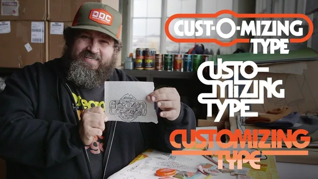
Aaron Draplin walks through his actual custom-lettering process for real Portland merchandise, and the raw energy is the whole appeal, not a polished curriculum.
Aaron Draplin's third Skillshare class follows the same formula as his earlier two: pick a real project, in this case merchandise for his hometown of Portland, and think out loud while making it. There is no slide deck and no abstract theory. The class opens with a junking trip to vintage shops and record stores, where Draplin photographs old signage and packaging to explain that reference hunting is not optional, it is the raw material for everything that follows. This sets the tone for the whole course. It teaches by demonstration rather than explanation, and the value depends entirely on whether that style suits the viewer.
From Default to Custom
The technical core sits in the middle lessons on kerning, tracking, and shape manipulation. Draplin types "Portland, Oregon, USA" in plain Helvetica Bold and calls it dangerous, meaning the default spacing a program spits out has no consideration behind it. He nudges letters with the option-arrow shortcut, then converts the type to outlines and ungroups it into individual shapes so each letter can be pushed, scaled, or overlapped independently. This is the most transferable skill in the course: the moment type becomes shapes instead of characters, a designer can start looking for accidental relationships, like an O tucking under an R, or a white offset shape laid over a letter to carve new negative space. The chopping and extending lesson pushes this further, showing how a letter's leg or bar can run long or stop short to create a more dynamic form, applied directly to the Portland wordmark he is building for a coin purse and later a patch.
The sketching-to-digital arc is the most structurally interesting section, though it also runs the longest. Draplin steps away from the computer entirely, tracing his own lettering by hand over tracing paper, hunting for accidental good shapes the way he does with junk-shop signage. He then photographs the sketch, imports it into Illustrator, and rebuilds it piece by piece, borrowing an N shape to inform an A, aligning gaps for visual consistency. It is a genuinely useful demonstration of how loose analog exploration turns into a disciplined digital build, though the pace is fast and assumes the viewer can follow along without pausing constantly.
Where It Thins Out
The preparing-for-print lesson is the most practically valuable section for anyone actually planning to produce merchandise, covering how to comparison-shop promotional vendors and build a clean production file with bleed, stitch lines, and pantone labeling. The two bonus lessons on adding texture and rebuilding a script typeface from a single sheared axis are worthwhile extras but clearly tacked on rather than core teaching.
The course's honesty about its own limits is also its biggest weakness for anyone hoping for a repeatable system. Draplin repeatedly says results are not guaranteed on the first try and that some choices are subjective, which is true but leaves the viewer without much of a checklist to apply independently. There is no discussion of type anatomy vocabulary, and the pacing through Illustrator moves quickly through menu commands that a newer user will need to pause and rewatch. This is a course about borrowing a working designer's instincts and habits, not a structured typography curriculum, and it rewards viewers who already have baseline vector skills and want inspiration for loosening up their own type work.
The standout
The live demonstration of ungrouping a typeface into individual outline shapes and physically overlapping letters to invent new custom ligatures is the technique worth the price of admission.
What you will learn
- How to kern and track type past its default settings by converting letters to outlines and nudging individual shapes
- How to treat letterforms as pure shapes to stack, overlap, and merge into new custom characters
- How to extend, shorten, and chop parts of letters (like an R's leg) to create dynamic custom forms
- How to move from hand sketches to digitized vector type by tracing and rebuilding shapes piece by piece
- How to prep a finished type design for print, including sourcing promotional vendors and building a production file
- How to age or refine finished type in Photoshop using noise, blur, and levels for a distressed or rounded look
Best for: Graphic designers and letterers who already know their vector software and want to loosen up their approach to type customization through observation of a working professional's instincts.
Skip it if: Complete beginners to Illustrator or typography fundamentals, since the course assumes comfort with outlines, grouping, and basic vector tools and never explains them.